Interior Design With Pink Tones
FASCINATING WORLD OF COLOURS: Pink
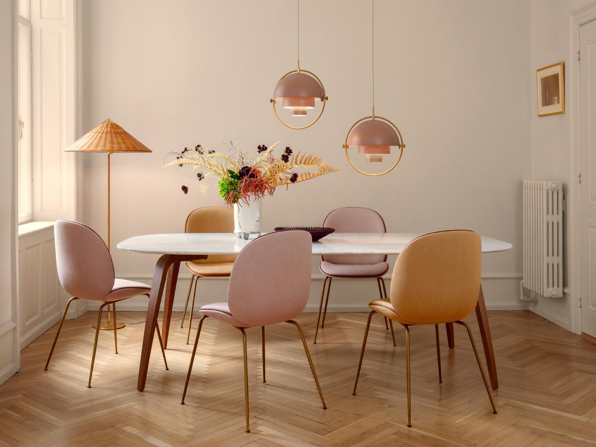
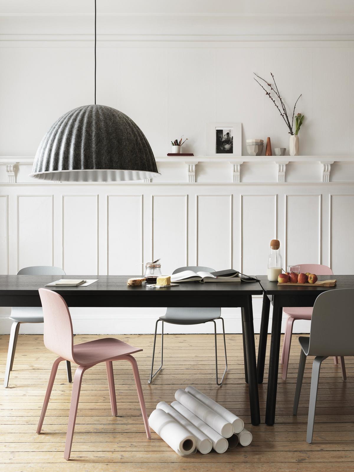
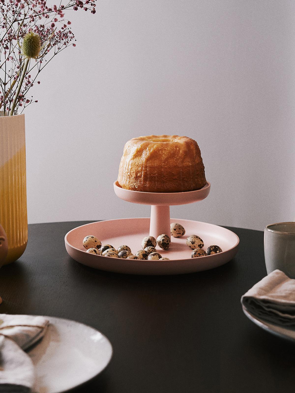
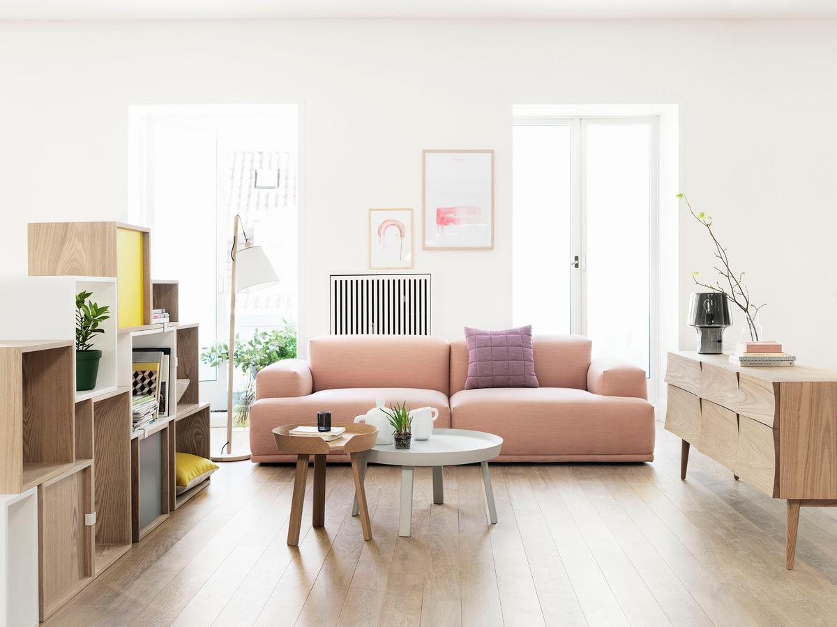
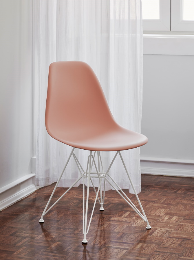
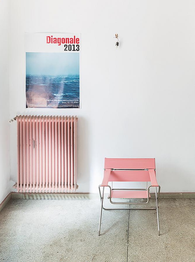
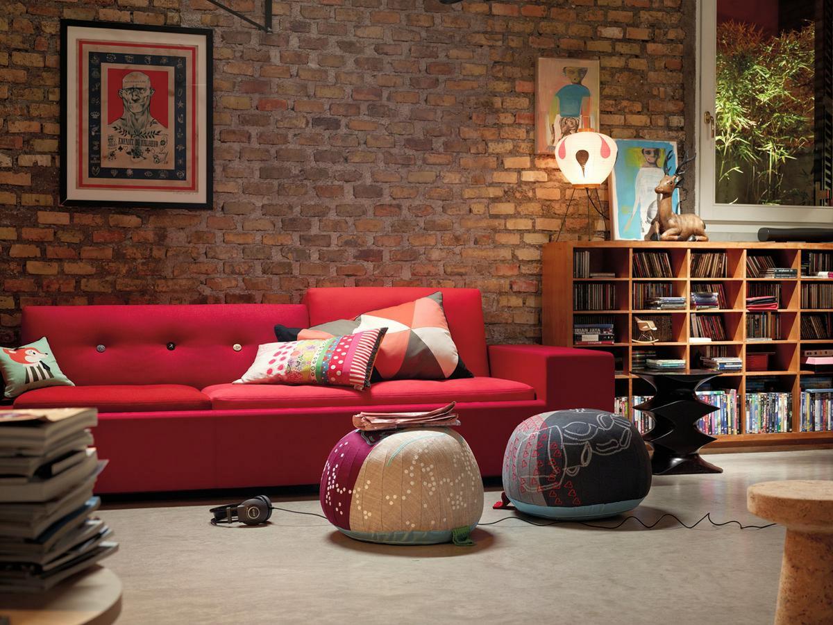
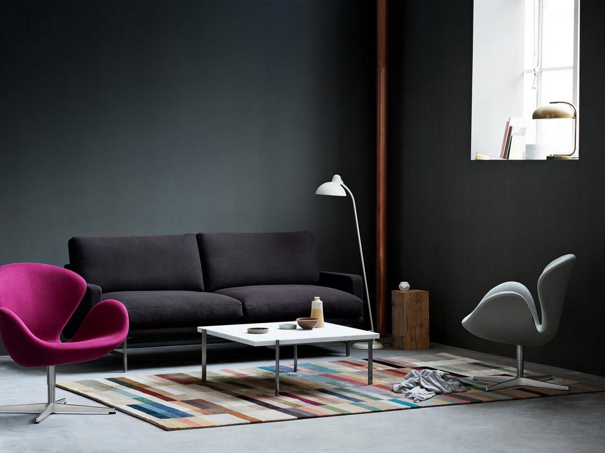
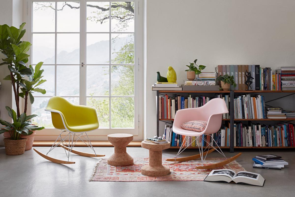
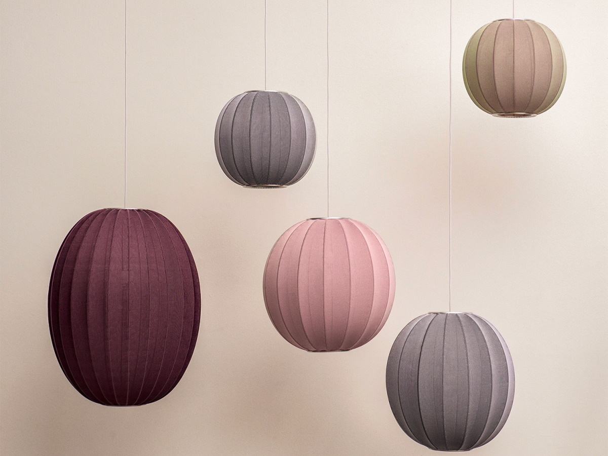
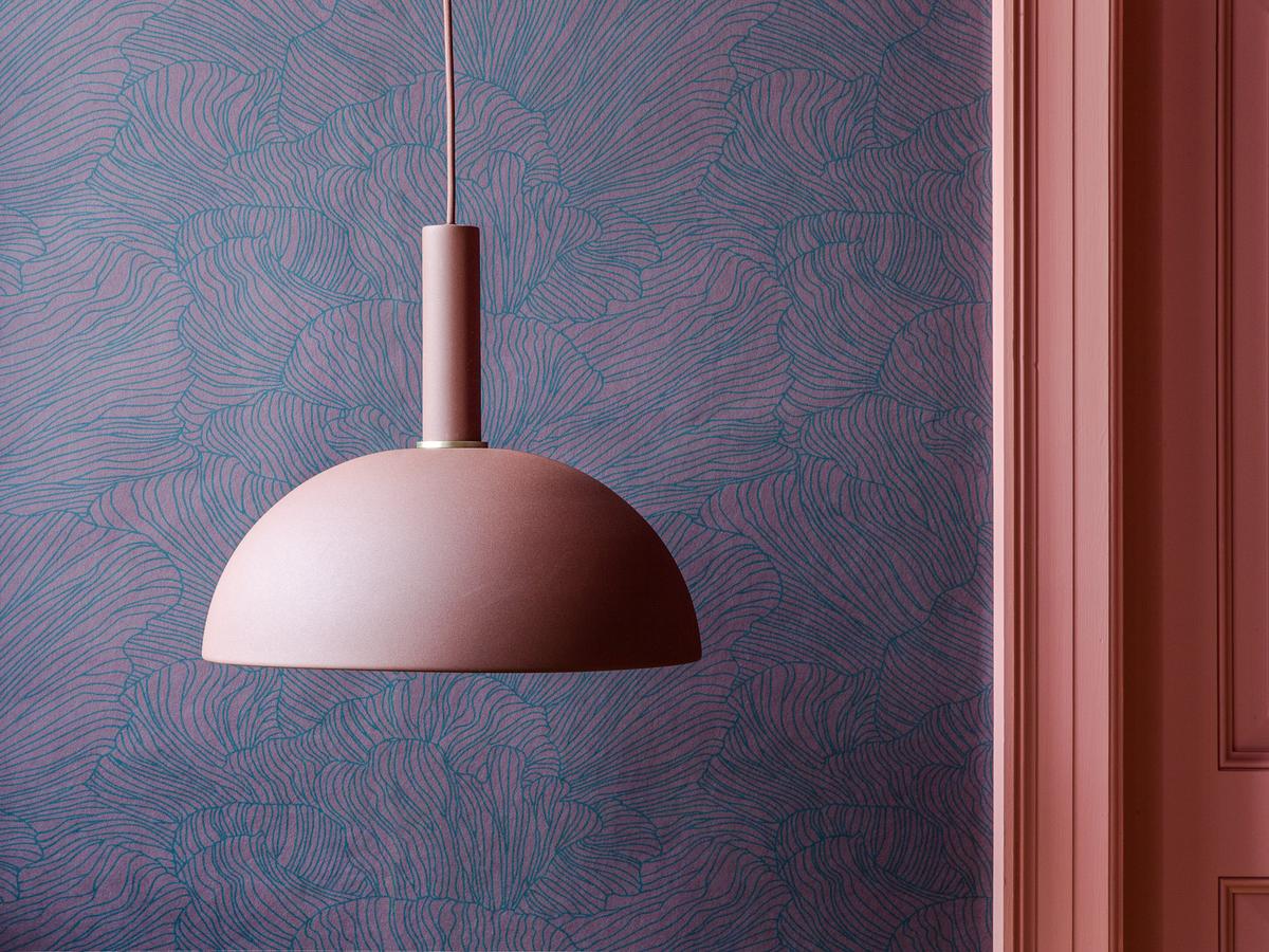
That the colour pink, amongst all colours, divides opinions is potentially related to the many gender clichés, and idiomatic expressions which can give the tone a negative image, and that although the colour has many positive connotations: the leader of the legendary Giro d'Italia wears a pink jersey, "in the pink" is where we all want our health to be, while the Pink Panther should be familiar to almost everyone - and Rose Quartz was the Pantone colour of the year 2016. In the context of the interior, the tone, which according to various sources suggests gentleness, is much less controversial: reflecting calmness and romance pink is an extremely versatile interior colour and convinces in modern and stylishly furnished interiors. As pink is mixed from white and red, pink tones exist in various shades from delicate to bright. As a general rule, it is advisable to add pink accents to the interior, too much pink can quickly become uncomfortable. However, if, for example, pink textiles or cushions with grey and wood tones are combined, the colour unfolds an irresistible harmony while maintaining its delicate elegance. Furniture in dusky pink or subdued pink tones are an absolute feast for the eyes and are particularly effective against white or grey walls. The combination of sober grey and pale pink has a particularly balanced and harmonizing effect and is fully in line with contemporary trends. In addition pink and red can be wonderfully combined with each other, since pink has a soothing effect on dominant red tones and thus gives them a playful, delicate shade. Pink is particularly fresh and harmonious when combined with turquoise or mint green.
To Vitality - Viva Magenta: Colour of the Year 2023
Lively, optimistic, powerful, positive - the Pantone trend colour of the year 2023 is a (colourful) cheer for life itself. The colour nuance is more than a simple eye-catcher and, despite its roots in the same colour family is readily distinguished from the Barbie core trend of 2022. Vigour, strength and courage are the properties attributed to the powerful shade of pink, as the Pantone Colour Institute describes it. Viva Magenta describes a nuance that pulsates and spreads happy vibes, as one would expect from colour psychology: Viva Magenta is close to the colour red, and posses the same power and strength, albeit with unmissable pink nuances. And thus maybe represents a new feminine strength that could be leading the way through 2023...
Viva Magenta: A pink-red with a bouquet of rust
In 2022, "Veri Peri" - a fresh, playful and yet clear shade of lilac - was the Pantone Colour of the Year, a choice which contrasted to prevailing social and global political events. The year 2023 counters with powerful strength. Viva Magenta makes a statement, a statement for life. And we would go a step further in our colour consideration. For us, the new shade is more in the red colour spectrum, which also reflects rust tones: the freshness of pink in its most mature form. As a wine, Viva Magenta would certainly be a full-bodied drop with fine freshness and a deep finish.
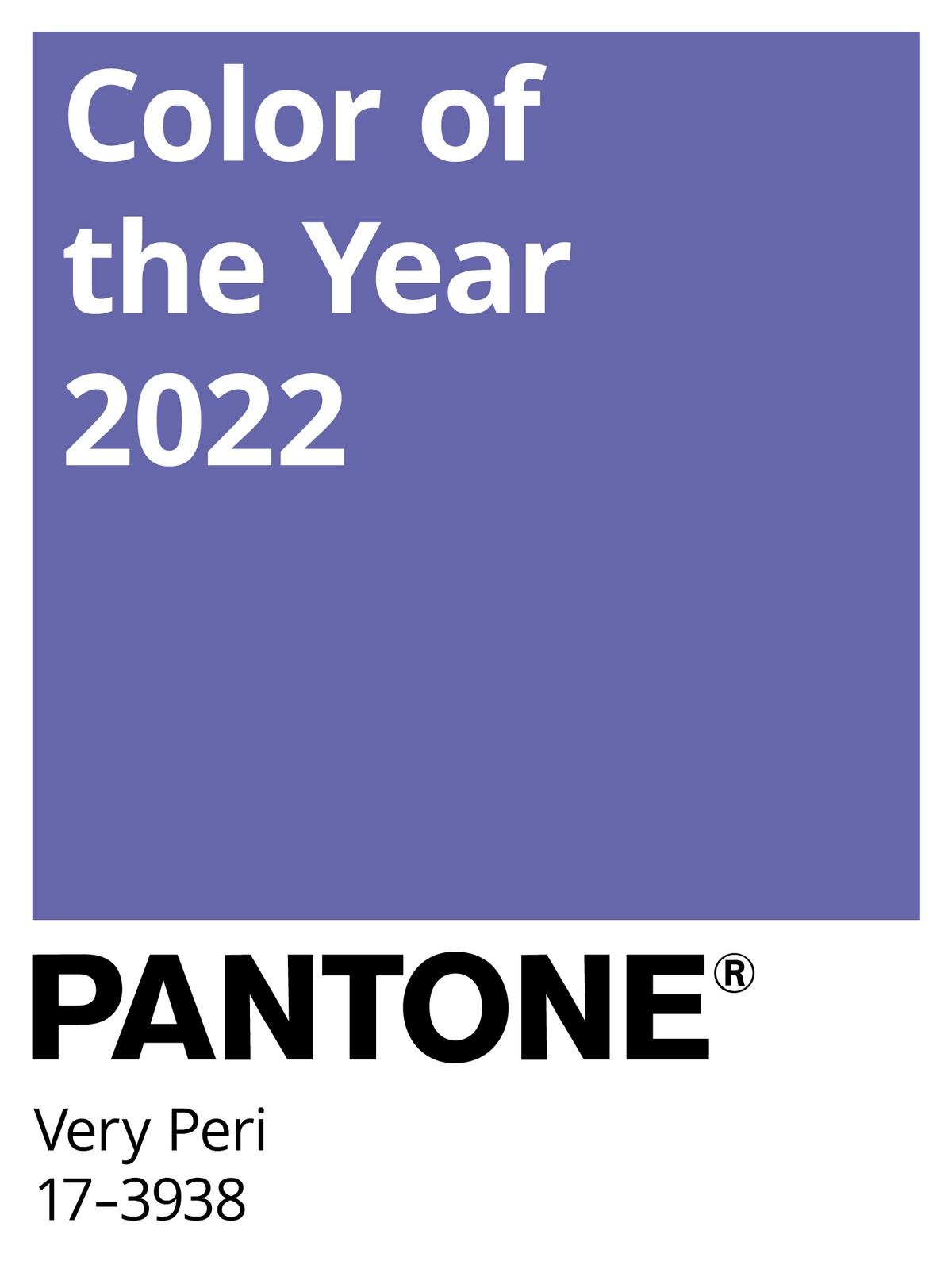
Pantone Colour of the Year 2022: Veri Peri
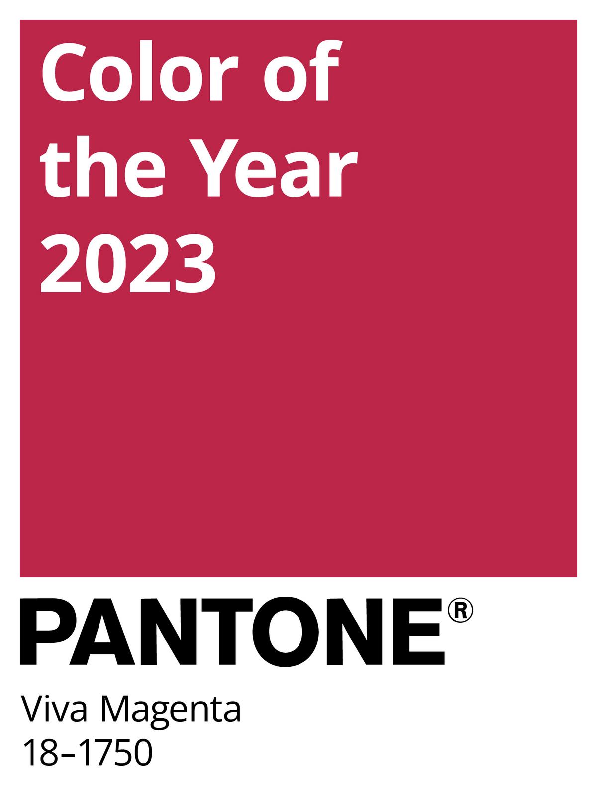
Pantone Colour of the Year 2023: Viva Magenta
As with all red and pink tones, Viva Magenta is ideal for setting accents in the interior. Much as women in red dresses are said to have an almost magical effect, and the same applies to interior design. In addition, the tone can be wonderfully complemented with berry, purple or even delicate rosé tones. A treat for any interior!
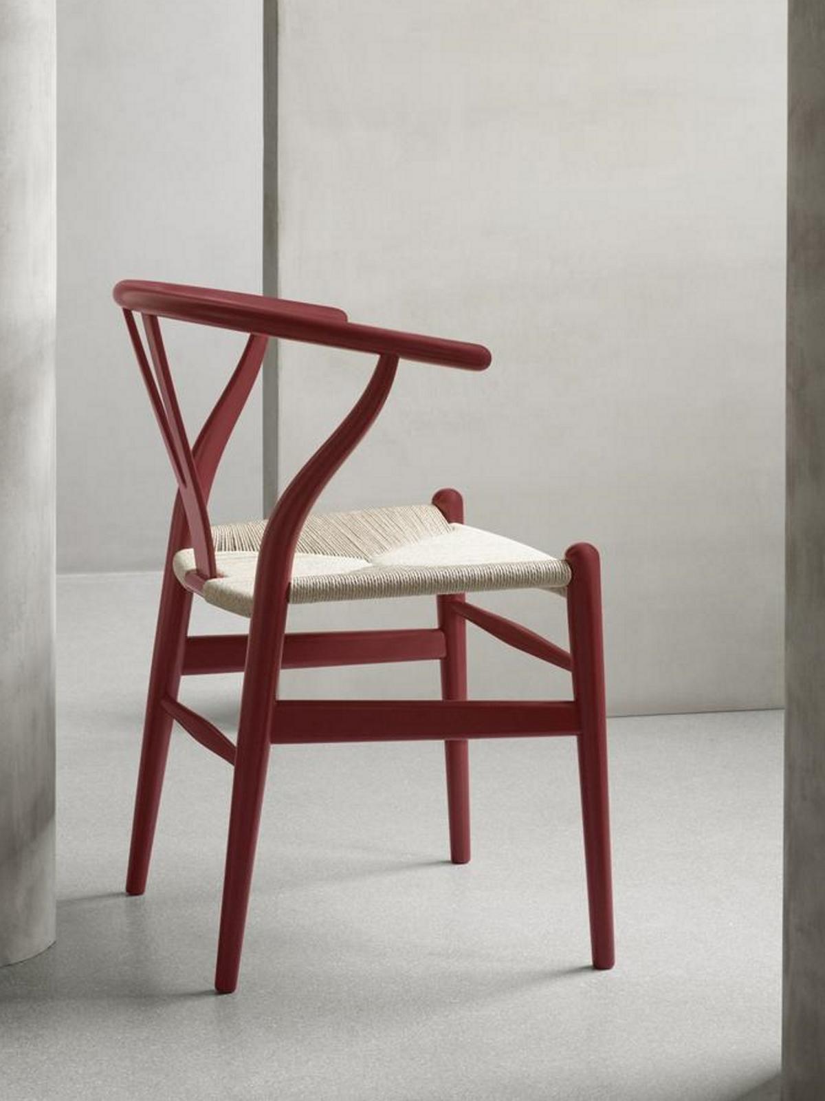
CH 24 Wishbone Chair Soft Special Edition from Carl Hansen, in Soft Falu
Individual colour consulting at smow
You are seeking a special colour concept for your home, would like advice on the choice of colour for a particular project, or you are looking for colour-coordinated curtains for your interior design? Our smow furnishing consultants will be happy to assist. In our smow stores you will not only find high-quality designer furniture in a wide range of colours, but also a wide variety of fabric and material samples as well as wallpapers, curtains and much more. Drop in and let yourself be inspired.


