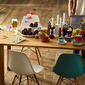
- Shelves & Cabinets
- Bookshelves
- Wall Mounted Shelving
- Sideboards & Commodes
- Multimedia Units
- Side & Roll Container
- Bar Furniture
- Wardrobes
- Occasional Storage
- Components
- ... all Storage


Colour Palettes
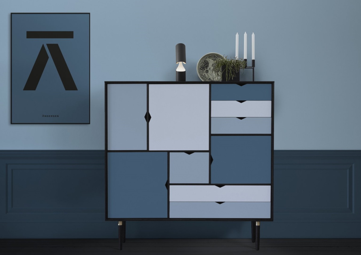
BLUE
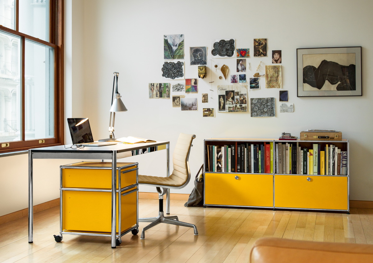
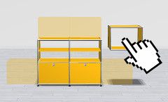
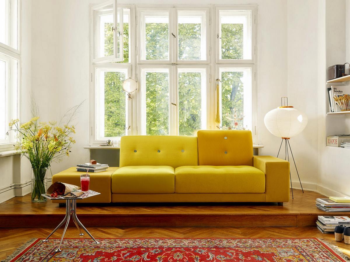
YELLOW
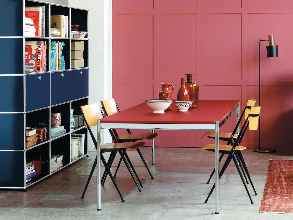
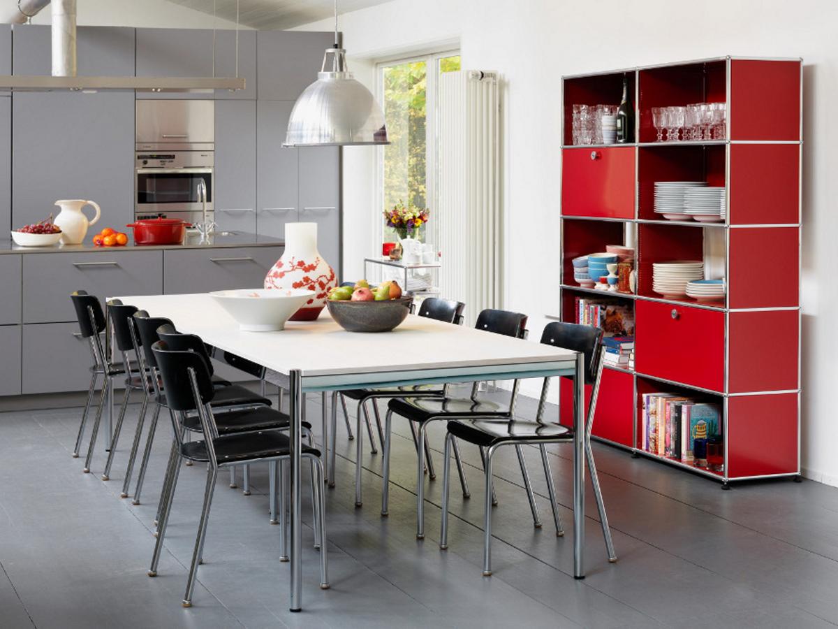
RED
GREY
GREEN
ORANGE
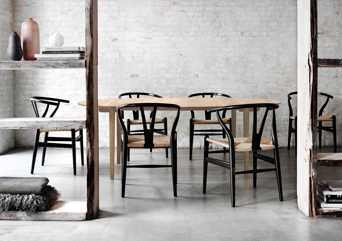
BLACK
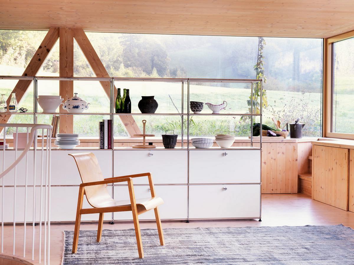
WHITE
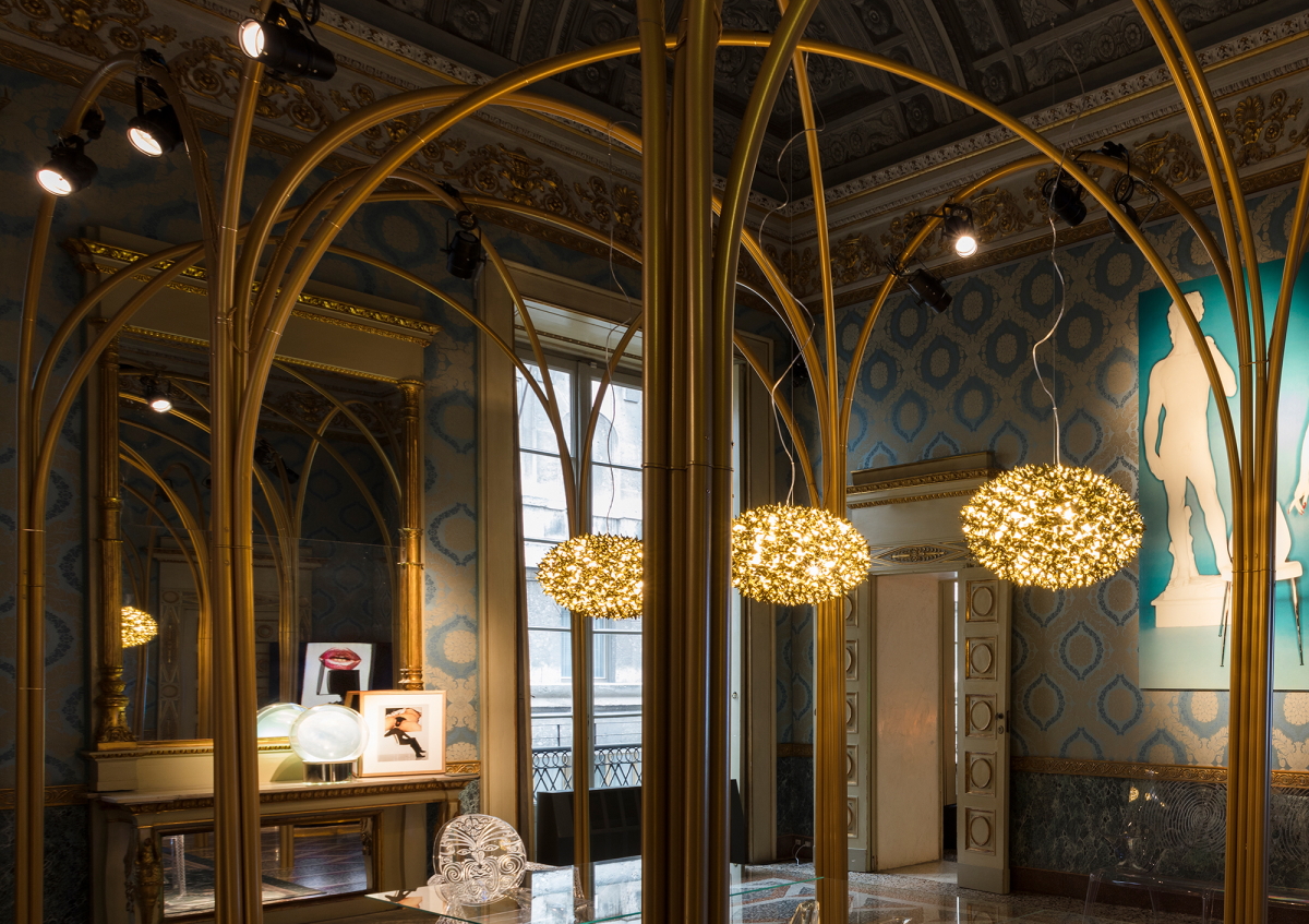
GOLD
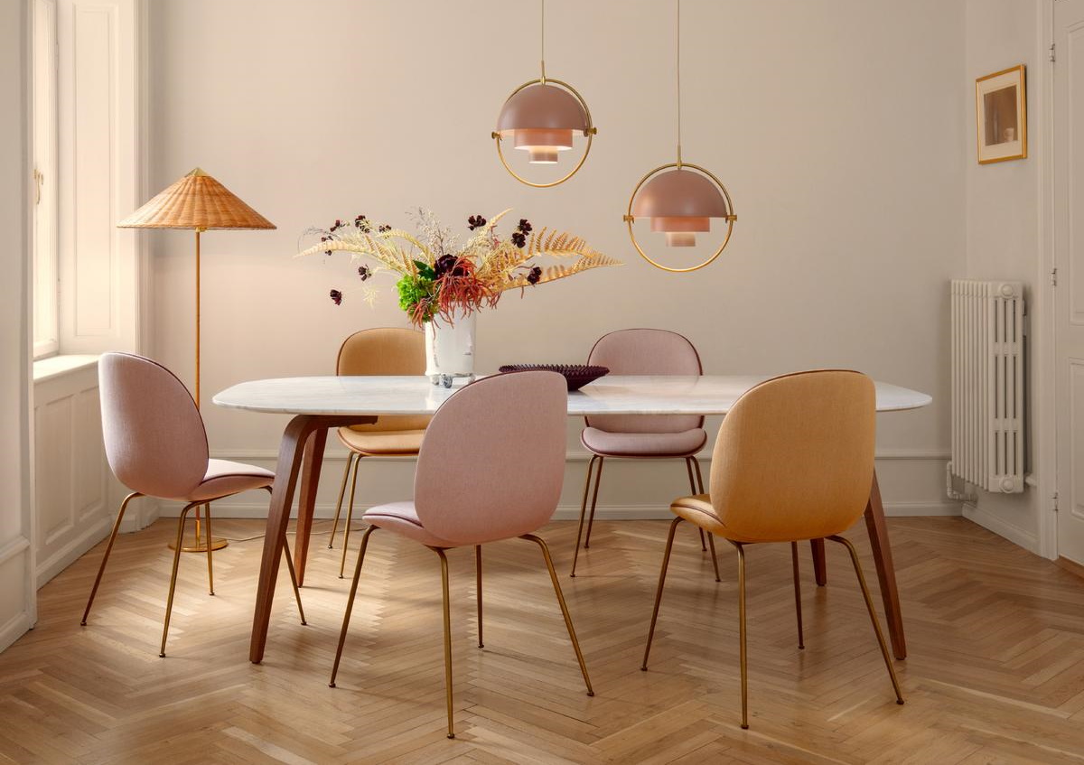
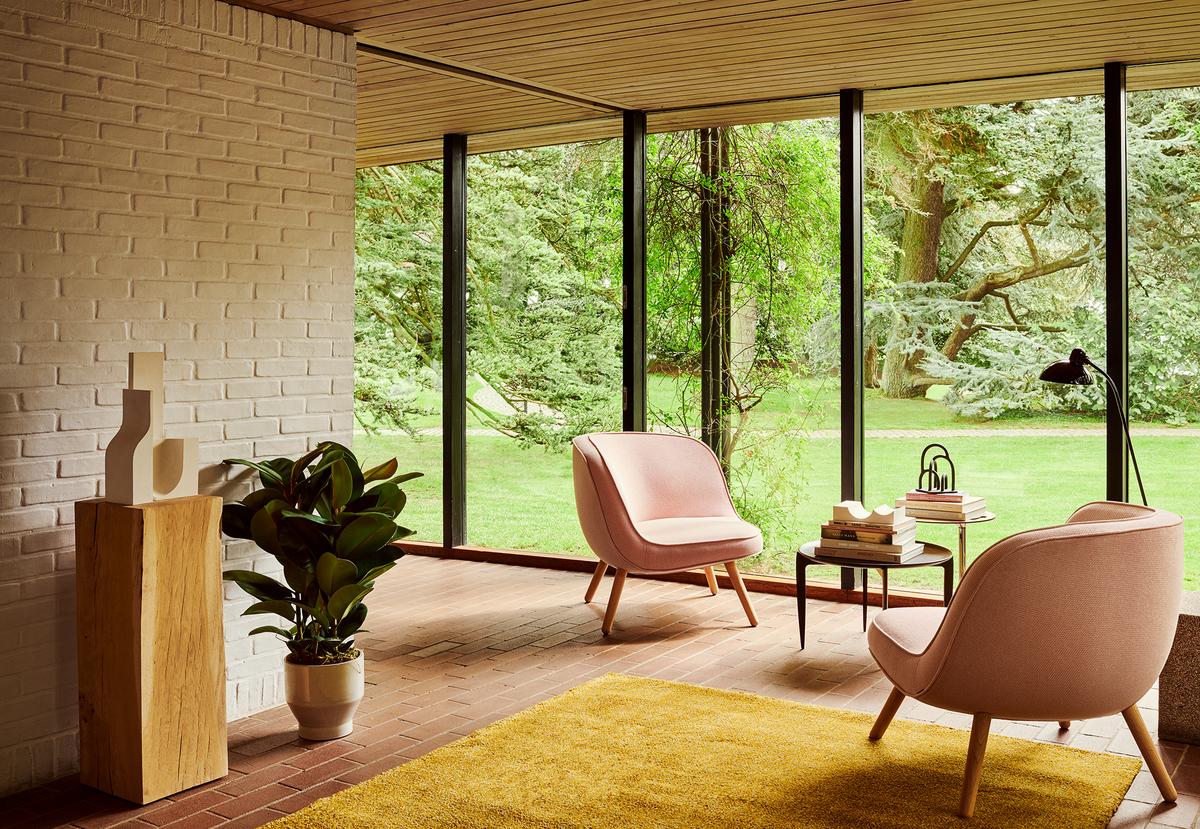
PINK
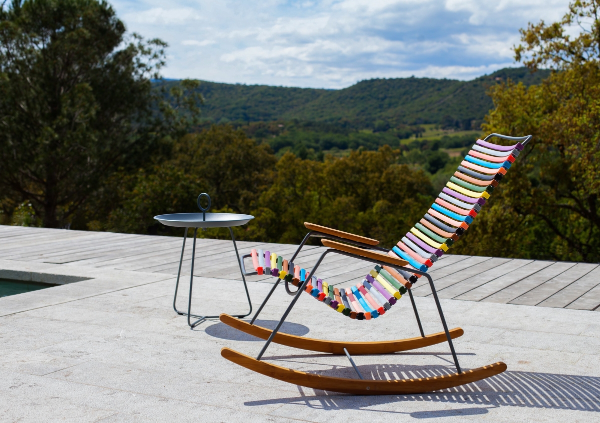
COLOURFUL
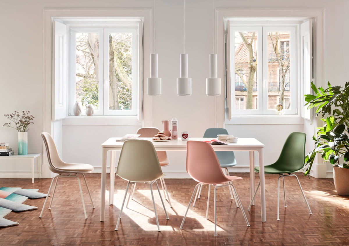
PASTEL
The right colour for your interior design
Colours trigger emotions and thus influence our mood. This is why the colour effect plays a decisive role, especially when it comes to interior design: we spend a large part of our time, whether at work or at home, in rooms, and thereby under the influence of colours. Thus colours should ensure harmony and create a balanced, uniform composition with the furnishings. Many use neutral white for the walls - white walls offer a proven basis for interior design and leave plenty of scope for colour combinations and changes. But if you want more colour in your four walls, you should proceed with self-confidence and intuition in terms of not only the walls but in terms of furniture selection and interior design. By way of a practical guide, we have put together some general rules, helpful tips and background information for you.
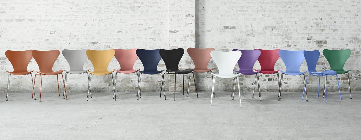
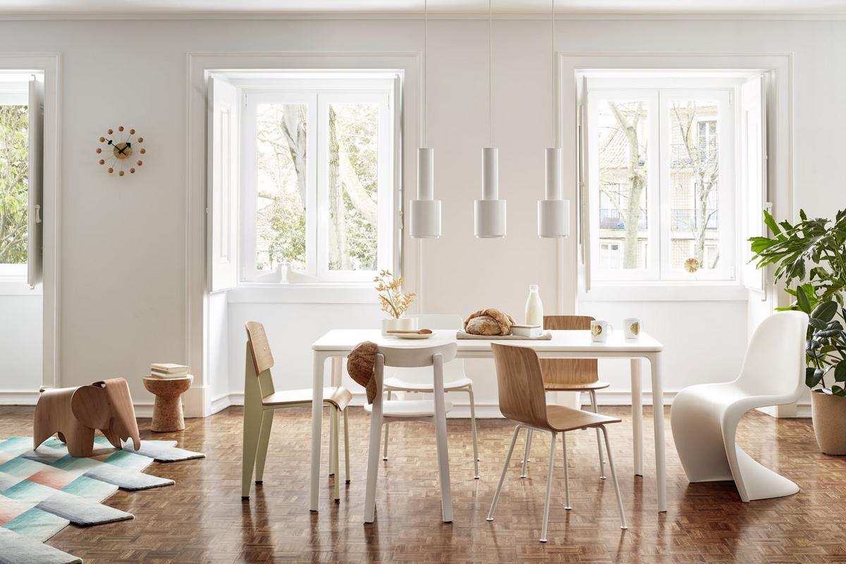
Colours tell stories - like the series 7 by Fritz Hansen
How do I find the right colour concept for my interior?
When choosing colours, relying on your own personal intuition and understanding is the best way to achieving a satisfying and sustainable result: this is however easier said than done. A good starting point is to create a colour concept with a maximum of 3-4 colours side by side: if the tones sit comfortably together on a piece of paper, they will also do so in your interior. Here you can fall back on a tone-on-tone colour concept or focus on contrasts. A look at the colour wheel provides a good orientation: colours that sit side by side here, such as yellow and green, create harmonious, flowing contrasts, exciting contrasts arise when complementary colours, i.e. colours that lie opposite each other in the colour wheel, are combined, such as, for example, green and red. Complete your colour concept with neutral colours such as brown, white, cream or grey in all their shades. Earth tones in particular are a treat for the eyes and ensure that the interior does not appear garish and restless. If possible, it is advisable to start small with the interior: Place a piece of furniture or another design object in your favourite colour, see how it relates to the rest of the interior, and slowly feel your way forward.
Warm and friendly living ambience
Colours and their effects
A simple colour wheel is divided into warm and cold colours. The primary colours yellow and red are on the warm side, and the primary colour blue is on the cold side. The transitions on both sides form the secondary colours, those which can be mixed from red, yellow and blue. The secondary colours include pink, violet, green, light green, turquoise and orange. Primary and secondary colours can in turn be mixed with black and white and thus produce mixed and grey tones in countless shades. Colours are perceived very differently individually, so that personal taste is the most important factor. Warm colours, however, always create a cozy, inviting and invigorating mood and reduce the size of rooms optically. The secondary colours pink, light green and turquoise alternate between warm and cold, appear fresh and cheerful like spring and make rooms appear larger. Cold colours in the blue spectrum recede. They ensure calm, a reserved, sober mood, visually expand rooms and are correctly used, elegant, subdued and contemplative. We have summarized the basic effect of the individual colours in the following table:
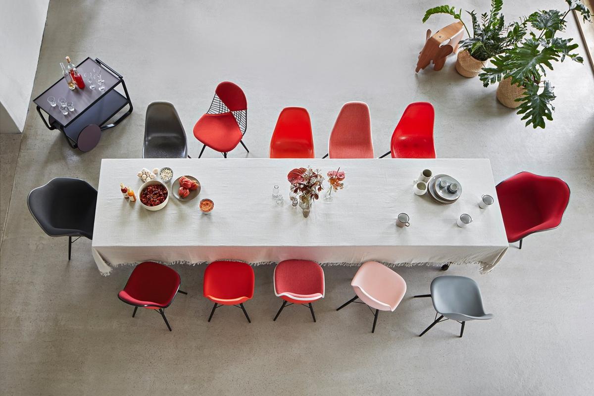
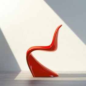
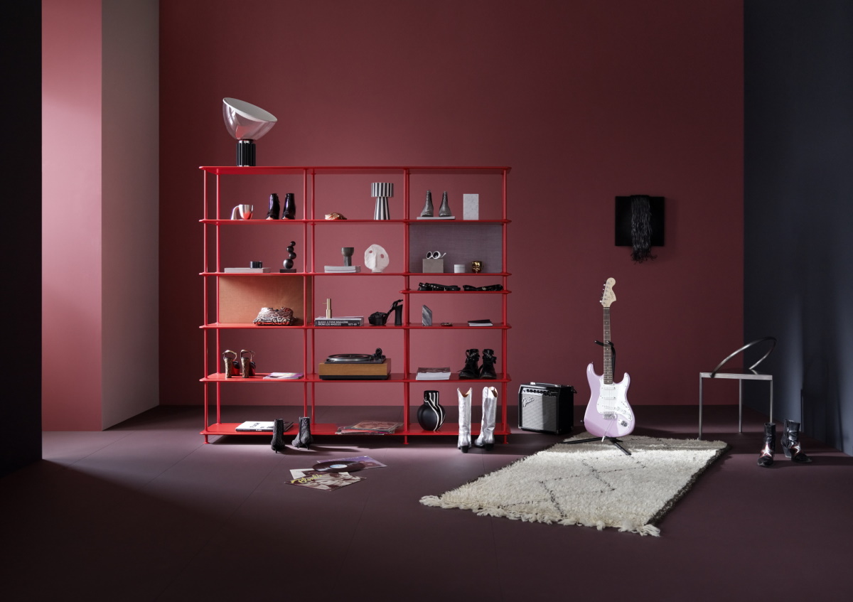
Vitra Fiberglass Chairs and Plastic Chairs in red tones
Red
The colour of fire, love and passion is said to have an activating, warming and dynamic effect. In addition, red stimulates the metabolism and appetite. In the interior, red is particularly suitable for setting individual colour impulses. Too much red, on the other hand, quickly causes unrest.
Yellow
Yellow is the colour of the sun and light and therefore triggers an optimistic, positive mood. As yellow also has an activating, stimulating effect and positively influences creativity, the colour is often used in children's rooms or conference rooms.
Blue
As the colour of the sea and the sky, blue ensures calm, concentration and clarity, makes us think and sometimes melancholic. Blue is therefore perfectly suitable for rooms in which you can relax. As the primary colour of the cold spectrum, blue tones can have a cool and refreshing effect.
Green
We associate green with meadows and forests. That is why green also has a harmonizing and calming effect on us and gives us a feeling of security, hope and balance. In this way, green creates the best basis for getting creative and is therefore suitable wherever people work or read.
Pink
Pink blooming flowers make us happy in nature. With pink sympathy, idealism and order are associated. In addition, pink has a calming effect and reduces aggression.
Turquoise
Turquoise ensures freshness and a pleasant coolness. That is why turquoise is particularly popular in the Mediterranean. We associate turquoise with freedom and openness.
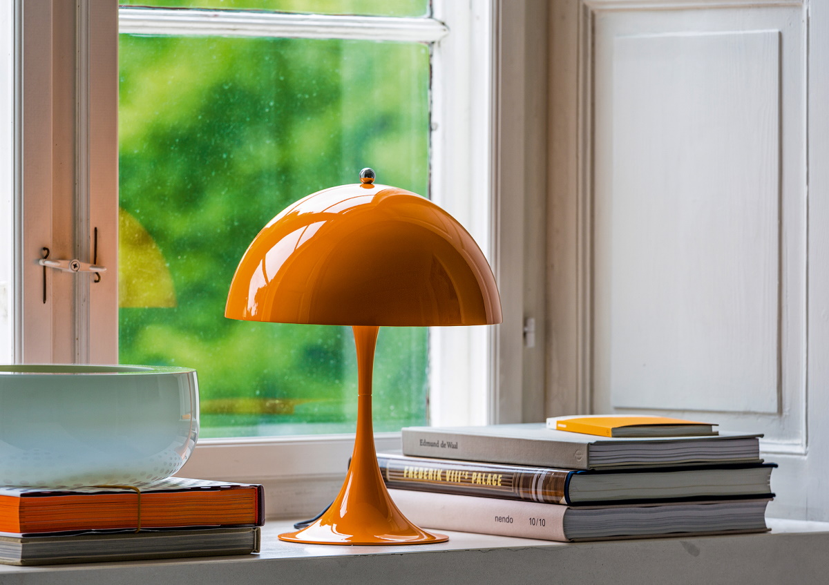
Orange
Orange conveys optimism and joie de vivre, brightens the mood and stimulates sociability and openness. In rooms, orange creates a cozy atmosphere.
Grey, red, green, pink, orange, white, blue? Which colour suits my style?
The appropriate colour for every room
Living room
In the living room, the family comes together after work and school to relax and daily life occurs, or can if it wishes to. Depending on the individual taste, very different colours can be used here. Warm and muted colours such as brown, orange or yellow ensure comfort and a particularly homely atmosphere. While green spreads harmony and brings relaxation to the living room.
Bedroom
In the bedroom relaxation and tranquillity are in the foreground. Muted blue tones and bluish grey tones are particularly suitable here. Pink and beige have a harmonizing effect and the purity and neutrality of white also assists us perfectly in finding a peaceful sleep.
Children's room
With a child's room, activity and tranquillity are equally important: they are rooms in which to play as much as to sleep. Ideally, you separate the two areas and decide on a suitable colour scheme. In order to support creativity, concentration and liveliness, there are no limits to the choice of colour and children are naturally fond of the colourful. Very bright colours and red are less suitable in children's rooms.
Kitchen/dining room
In addition to the living room, socializing is particularly popular in the kitchen. Here, warm, bright colours provide comfort and activate minds. Red is also said to have an appetizing effect. Due to its natural and fresh effect, green can also be the perfect choice for your colour concept in the dining room.
Bathroom
In the bathroom, blue and cool green tones bring freshness and a hygienic impression. Combined with a few green plants and splashes of colour in the form of runners, bathroom accessories or towels, the bathroom turns into a perfect wellness oasis.
Home office
Depending on whether you prefer peace and concentration in the home office, or whether you prefer working in an animated, dynamic and creative manner, influences the choice of the colour concept. Muted shades of blue promote concentration and calm and can be enlivened by elements in orange, yellow or beige: light green tones and activating colour accents in red or yellow provide a little more freshness.
Simple and beautiful colour accents
Tips for decorating with dark walls
Interior design begins with the design of the walls and floor. And while there is an assumption that bright tones are optimistic, inviting and friendly and dark tones are melancholic; this is an assumption that isn't necessarily true. Dark walls in combination with the correct furnishings create a particularly cozy atmosphere and a feeling of security. Whereby the following applies: the key to the mood is not light or dark, but the undertones - it depends on whether your wall colour belongs to the cold or warm spectrum. If you choose a dark wall colour, you shouldn't paint all the walls the same. In order to provide a higher, more spacious feeling, especially in low rooms, it is advisable to paint the ceiling brightly. Bright accents and wood tones for furniture and home accessories create a more relaxed effect on dark walls and ensure cosiness. Contrasts between the colours of the furniture and wall colours also give your interior a special nuance. Complementary contrasts enhance the colour effect of the opposite colour and have an invigorating and dynamic effect. The most important rule here: be economical. As is well known, less is more, and it is therefore advisable to create a base of muted colours and natural and wood tones and develope that with colour accents through home accessories, lights and individual furniture designs.
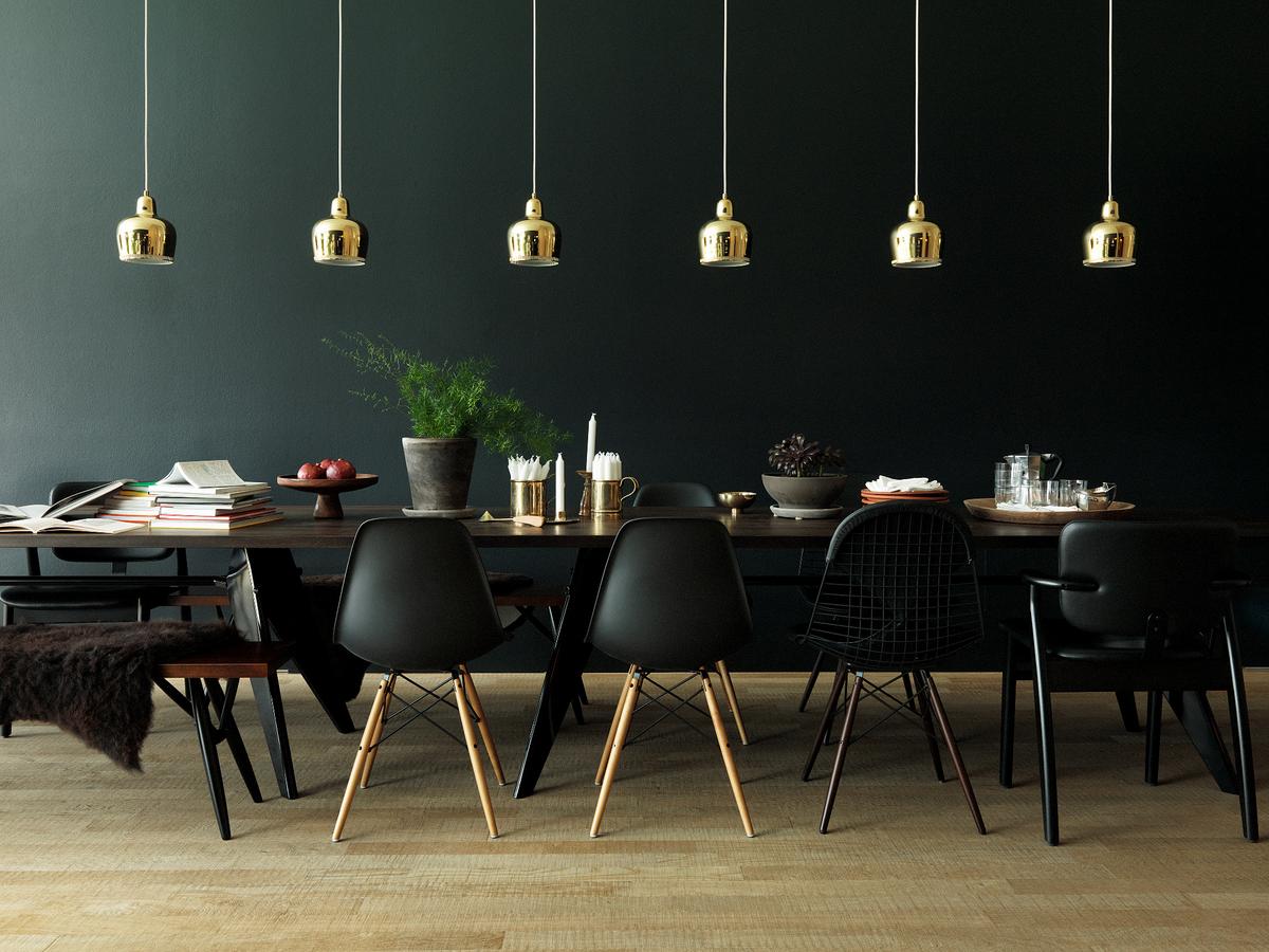
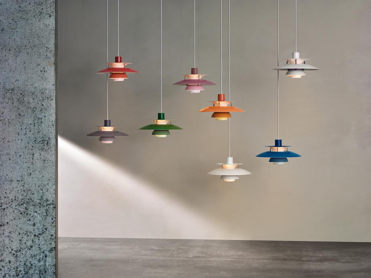
Dark walls in combination with golden Artek lights
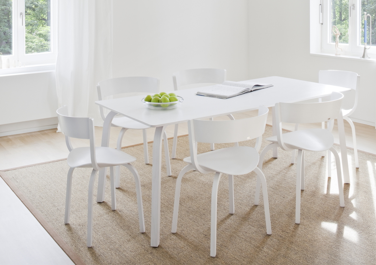
Minimalism in white tones
White is not a colour in itself, but its countless gradations make it an ideal starting point for interior design and allow a clear, wide fresh feeling of space. White tones have always stood for innocence, purity and light and are extremely versatile. In addition to cream tones, powder tones are particularly popular in wall and interior design. Warm white tones are preferred here because they are cozy and inviting. White tones can also be combined with all furnishing styles and colours. A predominantly white interior can be brought to life with bright colour accents in red, green or yellow. Black and white contrasts or the combination of white and brown or shades of grey provide elegance and have a luxurious effect.
Vitra Home Stories for Spring 2020
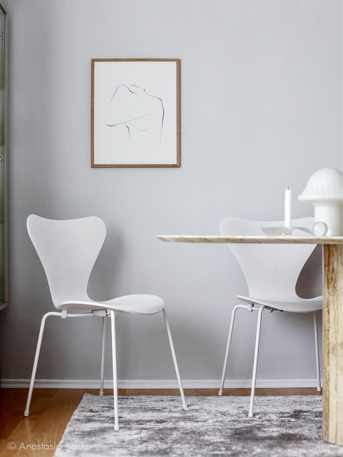
Serie 7 in white
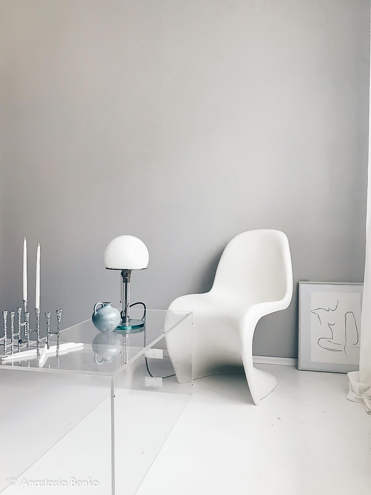
Vitra Panton Chair
Trend colours
When deciding on the right colour, we have the opportunity to fall back on new trend colours and current developments every year. Trend colours try to meet the lifestyle and current needs of people. If you are looking for a timeless solution and lay little value on transitory trend colours, the best starting point is to consider which colours best represent your individuality and from there develop an individual colour design. This can take a bit of courage, but it delivers timeless results and ensures that you still feel comfortable in a certain room even after years.
Pantone colour of the year
The Pantone Colour of the Year is chosen by the Pantone Colour Institute, which predicts colour trends and advises companies on brand identity and product development. The choice is made with the intention of reflecting the current zeitgeist and sets the trend for the areas of fashion and graphic design. The Pantone Colour Institute belongs to the US company Pantone LLC, which gained worldwide fame in 1993 with the development of the internationally recognized Pantone Matching System, and since when the Pantone colour code system has been the international standard in the printing and design industries.
For 20 years, Pantone colour experts have chosen a PANTONE Colour of the Year, based on extensive research and considered an indicator of the zeitgeist. In 2000, it started with the Pantone Colour of the Year Cerulean Blue, and in 2025 the colour of the year is now Mocha Mousse.


The Power of Colour
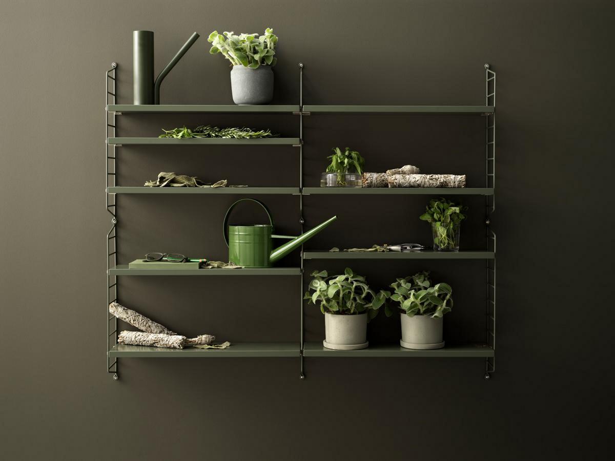
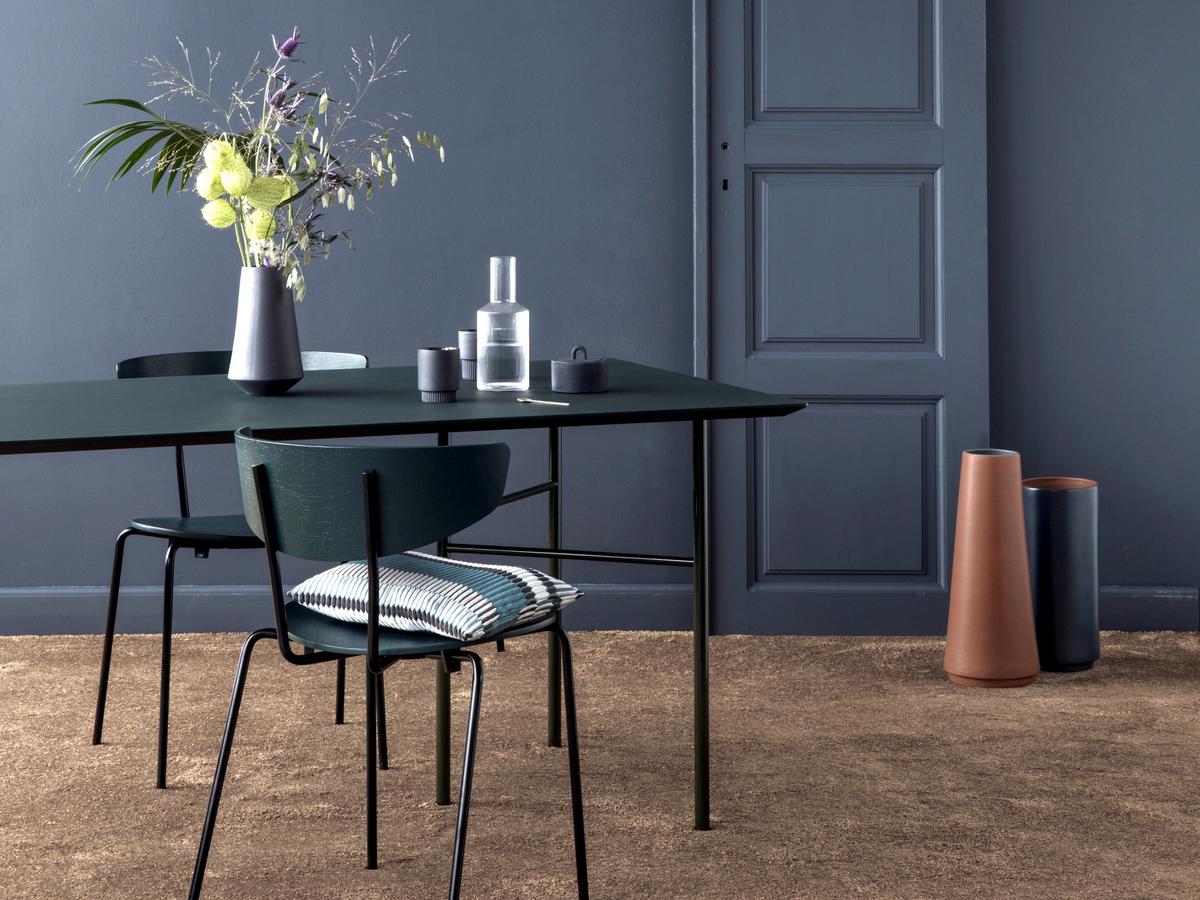
Tone on tone in lush green - harmonious and invigorating
Colours work unconsciously, and in doing can exert a tremendous power on our lives. Colour can change not only a piece of furniture, but also our emotional well-being, our social behaviour and our health. The language of colours creates communication. Colours give objects contour and shape, so one and the same piece of furniture in blue can convey freshness and appear serious, while in red it tends to a different symbolism.
Blue has a calming effect and a serious character
Red is lively and warm
The colours we choose communicate with others without the need for words: colour creates moods and triggers emotions, a form of self-expression is inherent in our colour choices, which is why certain colours are selected according to the occasion. In this respect, their cultural meaning also plays a role, our individuality is shaped by colour, just like the cultural meaning influences our individual consciousness. There is, for example, wide consensus in a European context that red is not a colour for funerals; a room in shades of red is however permissible - albeit as a matter of taste, and dependent on the prevailing mood.
All in our imagination, or where do the different effect of the colours come from?
Yellow is always dependent on its wavelength...
Children perceive colors differently than adults, on the one hand because preferences and perspectives change, on the other hand because our eyes also change and our eyesight declines. A brilliant yellow can shine as it always has, but we perceive it increasingly paler due to the change in the lens of the eye. Light also plays a role, because it consists of light waves that correspond in their different lengths to a colour: the famous wavelength. If the light with a certain wavelength creates a stimulus in our eyes, it is assigned to the respective spectral colour. We automatically link meanings beyond sensory perception with the different wavelengths, which creates the different colour effects, to which we in turn react culturally and emotionally.
How do colours affect our well-being?
Colours shape our memories, our attitudes. If an event is linked to a colour, this can consciously or unconsciously burn itself into our memory. If we then look at the said colour, the feeling associated with the event is reported. Well-being or discomfort take over. This applies to the individual as well as cultural awareness. Pink is probably the most controversial of all colours: it is easily associated with naivety or a Barbie image, although the colour Baker-Miller-Pink radiates harmony and lightness especially in the living room, especially in its bright spectrum.

A feel good colour: Baker-Miller-Pink
What role does light play in colour effects?
A room flooded with light literally shines
Without light, everything is nothing, arguably not so beautiful. In winter, when everything appears grey in grey, various strategies are pursued to brighten life. Candles are lit, rooms are decorated with accessories in warm or optimistic colors. It almost seems like we are recreating nature in its full summer bloom. In this way, designers and manufacturers can be inspired by nature, which follows its colour cycle. It is not for nothing that pieces of furniture are brought out in new colors that play with just such thinking.
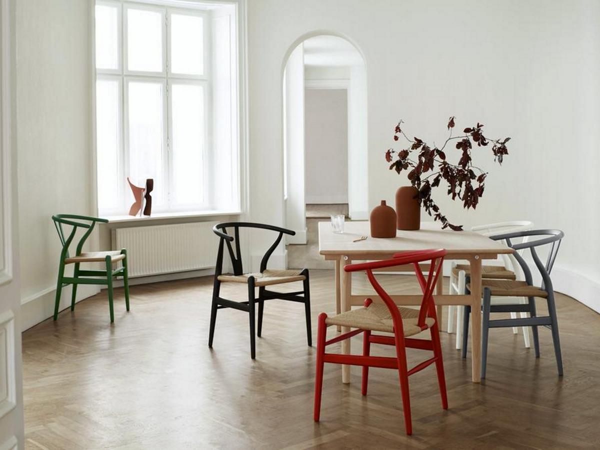
The Wishbone CH24 Chair was recently launched in new colour variations
"A good chair is never finished", Hans J. Wegner announced once.
Whether ecological, in terms of comfort or colour - a good piece of furniture is constantly in development. A process followed by Ilse Crawford, for example, who spent a year and a half with the manufacturer Carl Hansen & Søn reviving Wegner's masterpieces with a new colour palette. Inspired by tones from nature, Crawford created completely new colors that although appealing towards individualists, can easily be integrated into existing schemes and enhance them.
The former sturdy wooden chair, which appeared timeless due to its design and texture, is no longer just timeless, but with the new colour nuances exudes a certain charm, has a refreshing effect like the sea or calming and earthy like terracotta. Not only design enthusiasts can be enthusiastic about it, but also newbies who can easily find access to good design, craftsmanship and sustainability.
New colours not only lend a new shine, they can create completely new furniture.
Ilse Crawford gave Wegner's masterpieces a new life of colour
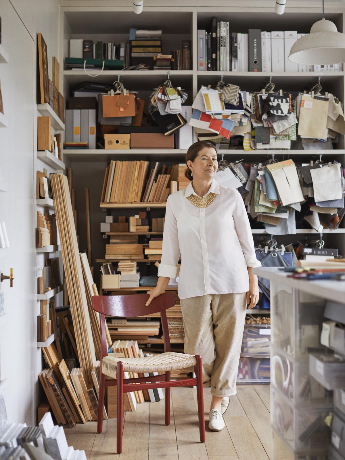
Individual colour consulting at smow
You are seeking a special colour concept for your home, would like advice on the choice of colour for a particular project, or you are looking for colour-coordinated curtains for your interior design? Our smow furnishing consultants will be happy to assist. In our smow stores you will not only find high-quality designer furniture in a wide range of colours, but also a wide variety of fabric and material samples as well as wallpapers, curtains and much more. Drop in and let yourself be inspired.