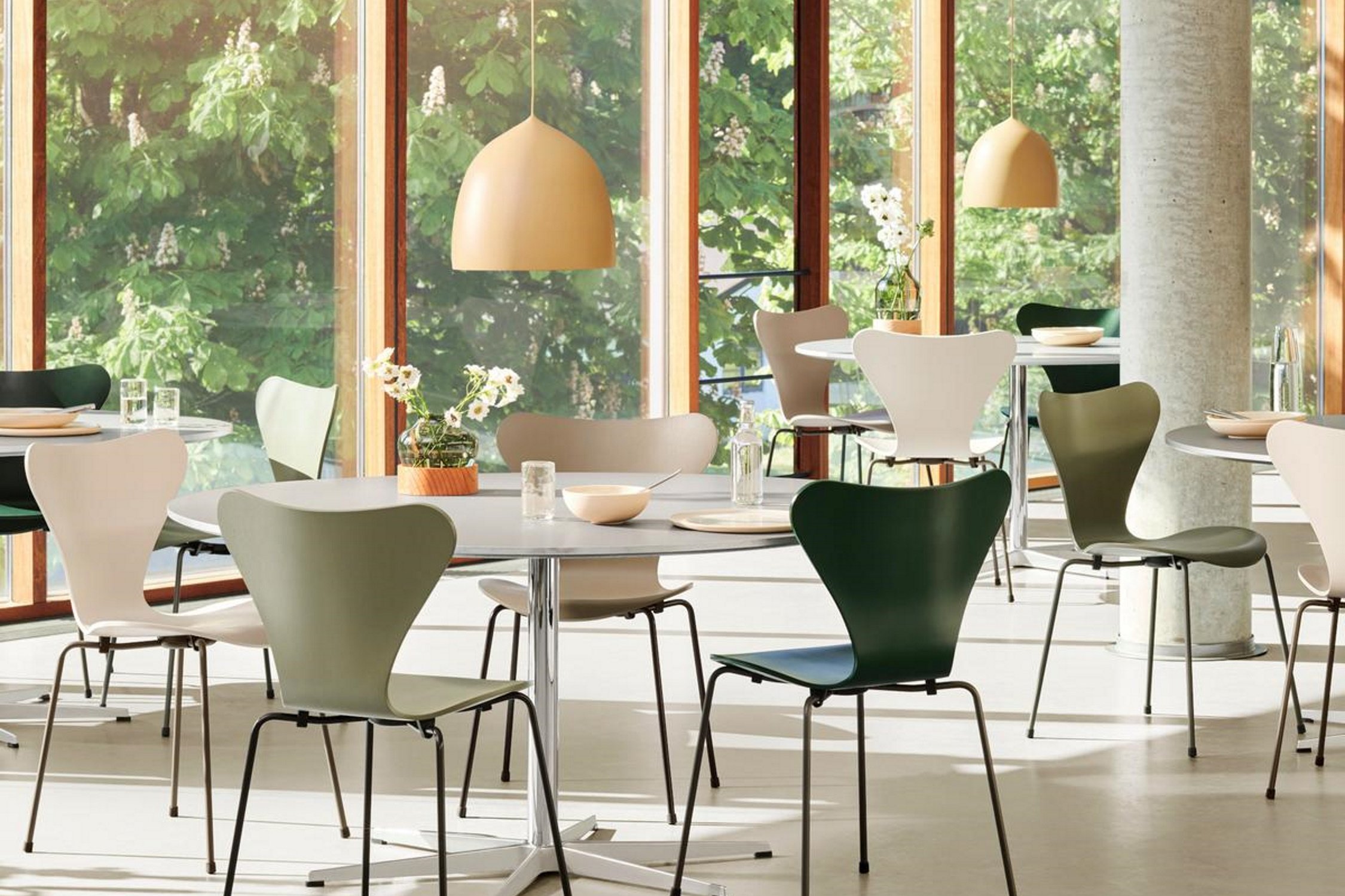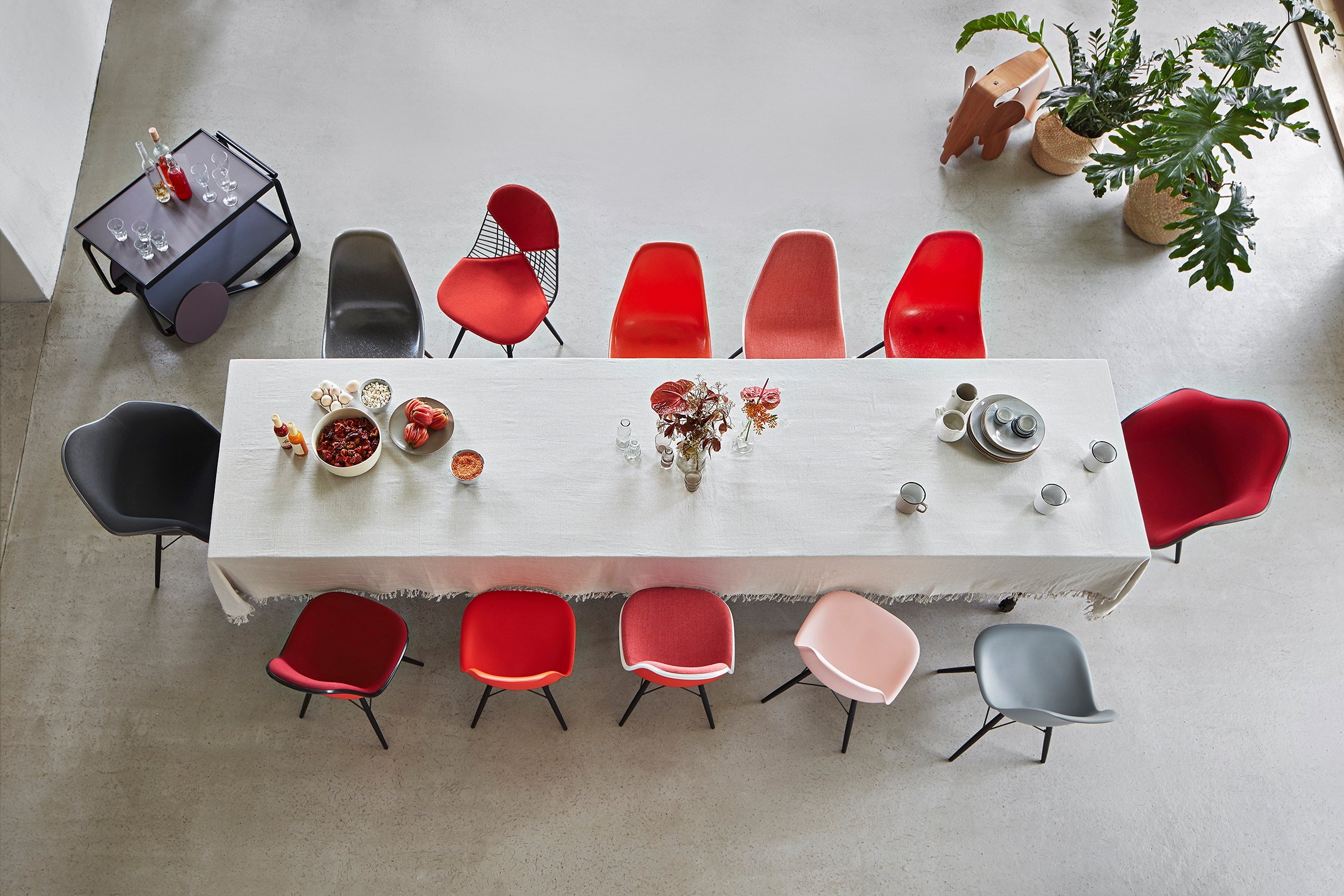

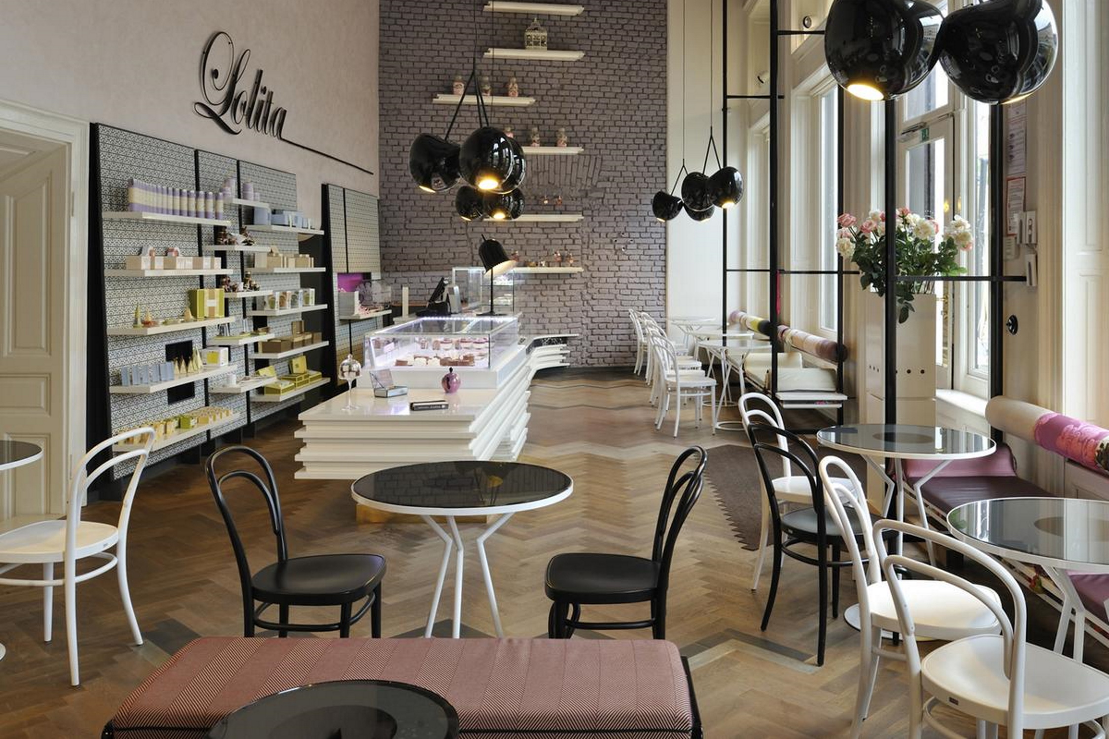
Today, especially in urban areas, there exists a gastronomic scene that, with its myriad possibilities, has long ceased to just satisfy the hunger of its guests. A visit to a restaurant or café is much more an experience, an occasion to get together with friends and the opportunity to immerse yourself in another world. In addition to the culinary variety, it is often the atmosphere that allows us to escape our everyday lives for the duration of a meal. According to a Statista study from 2017, 23 percent of 952 Germans surveyed eat out in restaurants several times a year. 19 percent even do this several times a month and at least 12 percent take advantage of the weekly opportunity to eat out. If you try to get a seat in a nice café on the weekend, you get the impression that it's about more than just eating and drinking. You enjoy the scenery, the company - the opportunity to get out. The works canteen can perform the same function during the lunch break. In all cases a good interior design is crucial for success. Especially when the offer is geared towards getting something to eat quickly, the furnishings must also be to the point. Is the canteen clearly laid out, can you sit comfortably? Or do you prefer to get something to go from the nearby café? Whether canteen, café or restaurant: gastronomy companies not only need a practical menu, but also a well thought-out furnishing concept. In addition to certain regularities, this should follow a common thread and reveal a coherent overall picture that expresses the signature and character of the gastronomy.
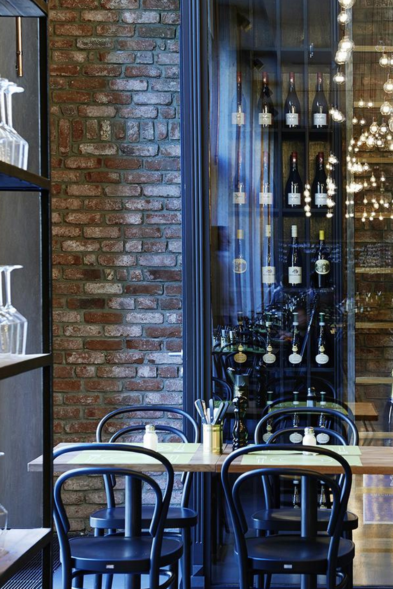
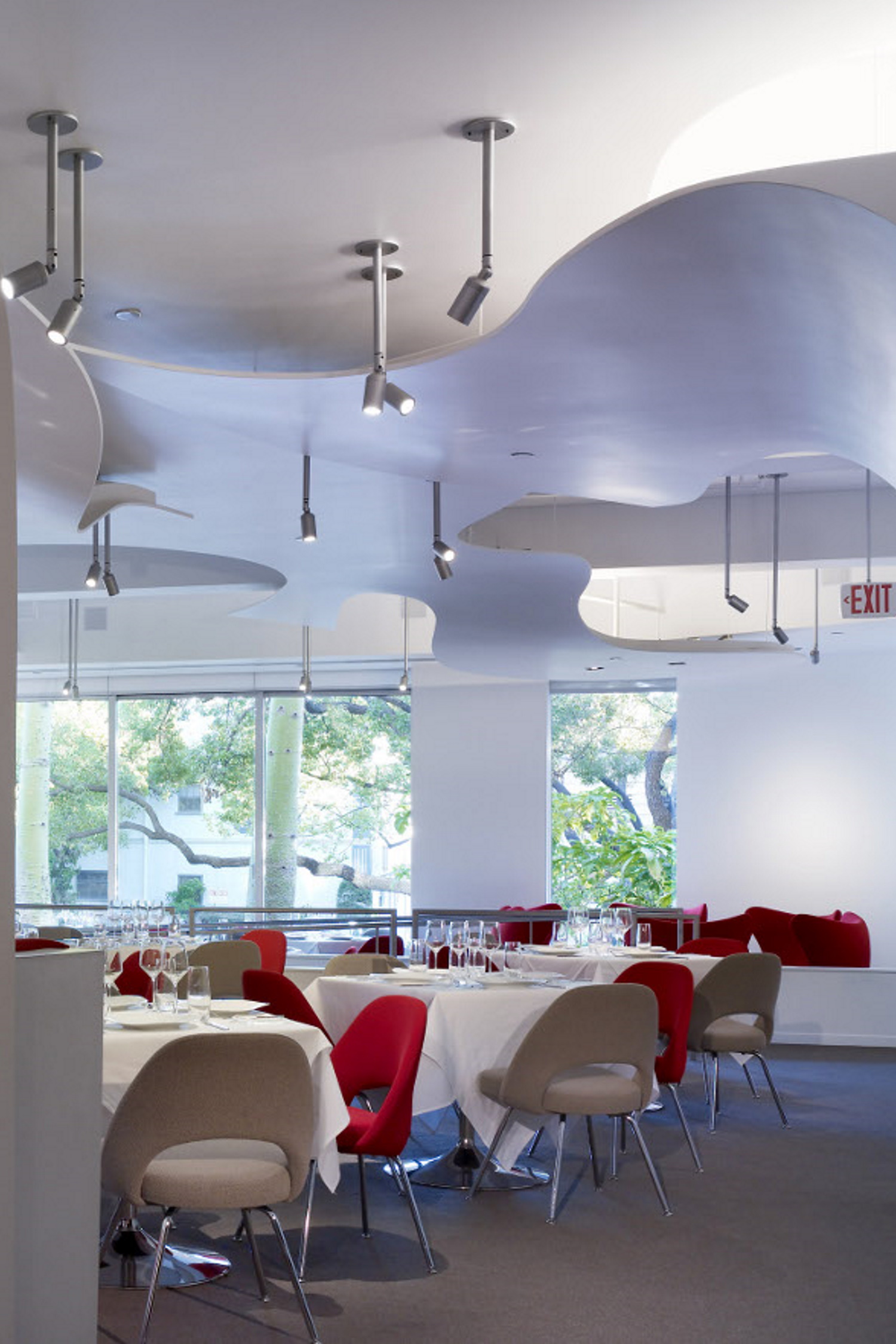
Before the new opening or the renovation of gastronomic spaces, questions arise as to the specific core offer - and how the expectations of customers can best be met. The furnishings are preferably based on a corporate design that represents a uniform image from the outside signs to the floral decorations to the menu. Because not only individual ideas play a role, but numerous general factors must be taken into account and regulations must be observed, you are faced with a very complex planning project with many important steps:
1.The legal: Building regulations & accessibility
Building codes differ by country, and often by region. However, regardless of specifics it is always a matter of ensuring that all processes and work steps can be carried out without any problems and that maximum safety precautions are implemented. In addition, accessibility for people with reduced mobility must also be taken into account, and it is not just about the unrestricted use of the toilets, but, for example, also about seating at the bar. As the implementation requires a high level of specialist knowledge, it is advisable to involve professionals in the planning.
2. The basis: Designing a floor plan
The restaurant floor plan shows the arrangement of all spaces. In addition to the distance between the individual areas, it shows where tables, doors, sockets and the water supply are located. The floor plan is not only an essential tool for interior planning, but also an important aid in catering. Efficient routing ensures faster operation and ideally ensures higher sales. A clearly visible illustration of the restaurant floor plan in the staff area and guest room also helps new employees and guests to orientate themselves within the space. Functional floor plans are best designed by interior designers. They take into account applicable building regulations, individual needs and aesthetic considerations.
3. The heart: Equipping the kitchen
Whether restaurant, café or canteen, the heart of every gastronomic facility is the kitchen. There every move must sit first time and that is only possible with perfect planned of the fixtures and fittings. Unnecessary walking distances or long searches for cooking utensils and ingredients must be avoided at all costs. The aim is to serve guests the ordered food as quickly as possible - perfectly arranged and at the desired temperature. Professional planning therefore includes, among other things, sufficient space for staff to move around, clearly defined work areas, functional ventilation systems and high-quality equipment. In addition, the technical integration of a digital ordering system can facilitate communication between service and the kitchen and optimise processes.
4. The style: Selecting furniture and decoration
When it comes to the interior design of restaurants, furniture is the ultimate stylistic element. In combination with decoration, they convey modernity, cosiness, exoticism, urbanity or much more at first glance. Regardless of the style and price range, it is always advisable to choose a high-quality solution. Durable furniture is a long-term investment. Robust materials are the best choice, especially in canteens or cafeterias, but durable furnishings also pay off in any other hospitality establishment, not least because they give the space a high-quality impression over the years. When it comes to the question of which furniture is actually needed, what fits the concept in terms of style and function, and how a coherent overall picture can be created with the right degree of decoration, interior design professionals can help.
5. The atmosphere: Planning colour and light
The atmosphere in rooms is largely defined by colour, light and texture. By relating these aspects to one another, they define the identity of an institution. They create the effect of gastronomic spaces. When planning interior design concepts, colours and textures can also be used to react flexibly to trends and seasons. With professional lighting planning, taking into account the biorhythm, the mood of the guests can also be influenced. The goal of any planning is that people feel comfortable in the space.
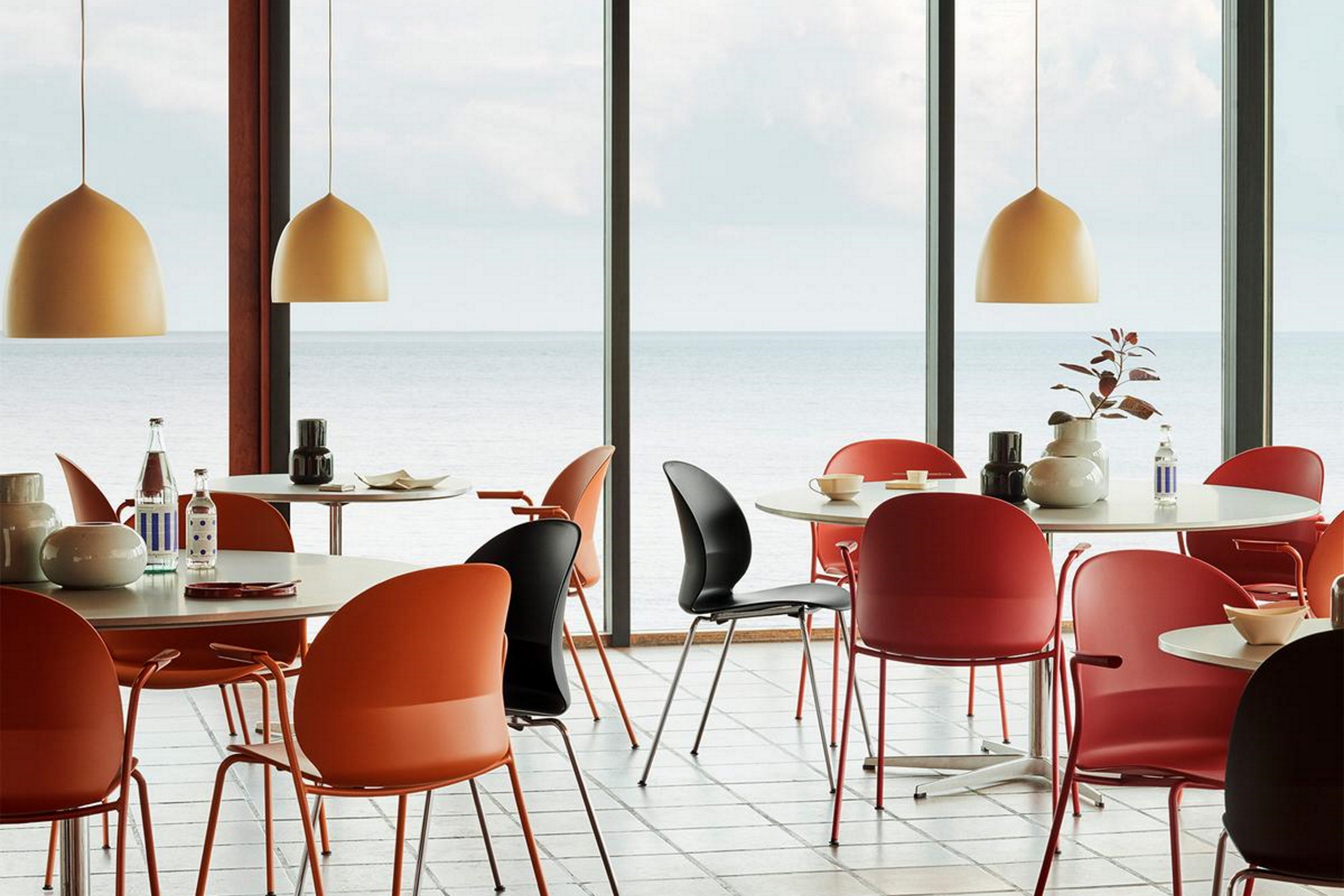
As soon as the catering space has been acquired, the first step in the planning of the furnishings is to divide up the available area as effectively as possible. Certain intrinsic elements must be taken into account, regardless of whether it is a modern restaurant, small café or large canteen - in addition to the kitchen and dining room, for example, a cloakroom, an entrance and lobby area as well as toilets should be planned. The essential spaces of the catering facility are set in relation to one another with the help of the floor plan:
When it comes to space allocation, the rule of thumb is that around 60 percent of the restaurant should be reserved for the dining room, lobby, bar and toilets. The remaining 40 percent of the available space are for the kitchen, storage room and other service areas. How much space is to be calculated per guest does not only depend on the total area, but also depends on the type of restaurant:
In addition to the actual numbers, visual perception also plays an important role when furnishing restaurants, cafes and canteens. The proportions of the room are influenced, for example, by colours: mostly bright rooms appear larger than dark ones or those painted in strong colours. If everything is designed in a single colour, the boundaries in space disappear. The other way around, the effect can be used for difficult-to-inhabit surfaces by optically shortening long, tubular rooms with a darker transverse wall at the front. In very high or low rooms, perception can be guided by the colour of the ceiling: If the ceiling is painted the same colour as the walls, this opens up the sense of space and makes it appear taller and larger. If a very large room is to appear more cosy, this can be achieved with dark ceiling colours.
In general, it is also considered advantageous if restaurant or café interiors can be seen from the outside. If at least part of the dining room is visible before entering, this can attract customers. A well-staffed establishment inspires trust and tends to be worth a visit rather than a deserted one. The same goes for staff canteens.
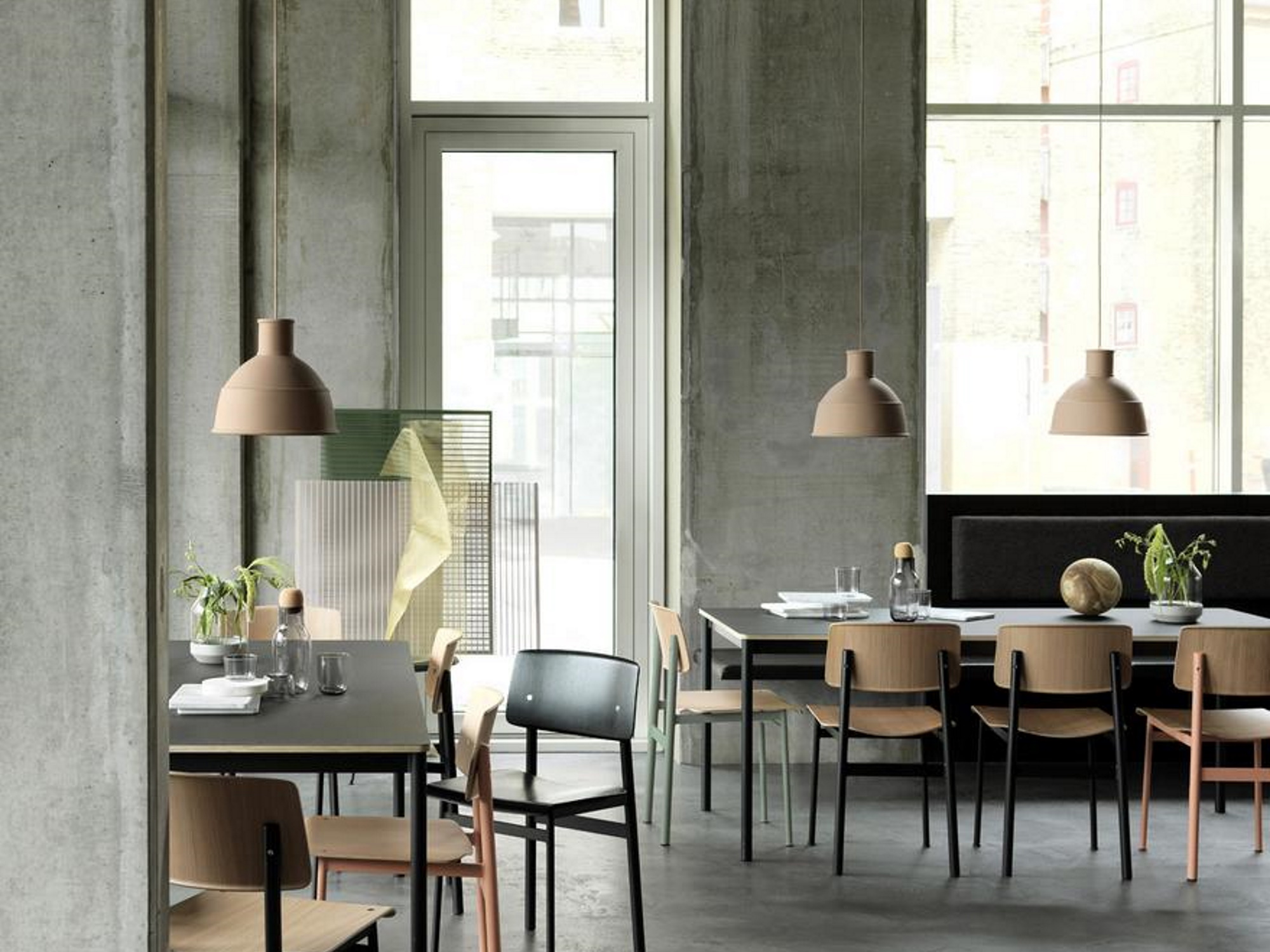
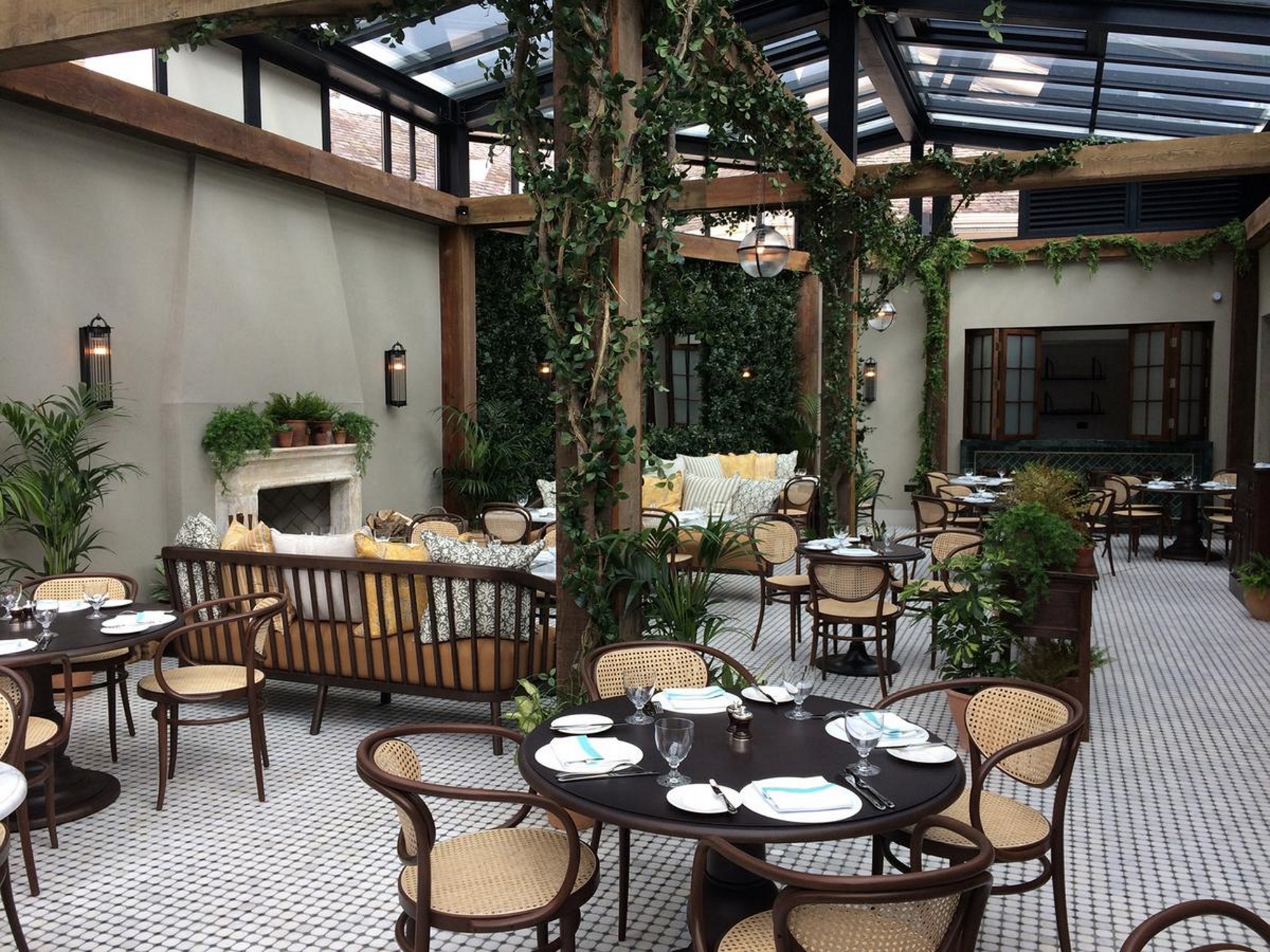
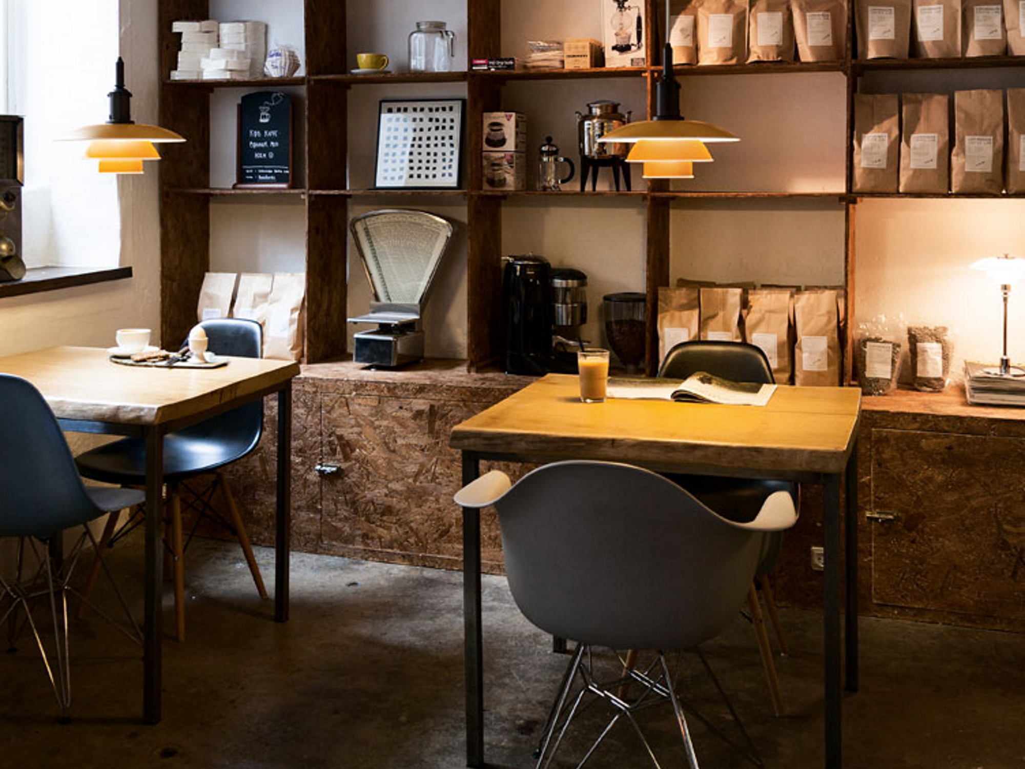
Once the decision has been made for a specific service model and the rough space planning has been completed, the next step is the interior design - and thus the gastronomic experience. What mood should the restaurant or café evoke in the guests? Is a cosy, traditional room required or should the furnishings appear clean and modern? It should be noted that guests draw conclusions about the offer and pricing from the materials and furniture as well as the colour scheme. In this sense, the service model, the menu and the aesthetics of the restaurant ideally form a symbiosis. The sum of all parts is tailored to the desired target group.
The gastro experience begins long before the food or drinks arrive: the first impression is made by the facade and the signage. Guests perceive it as positive when signs - day and night - are easy to read, simplify orientation and appear neat. The feel-good atmosphere in good restaurants extends from the car parking to the table and begins at the latest when you are greeted at the entrance, perhaps with a view of an inviting bar: when we enter a room, we form an opinion within seconds.
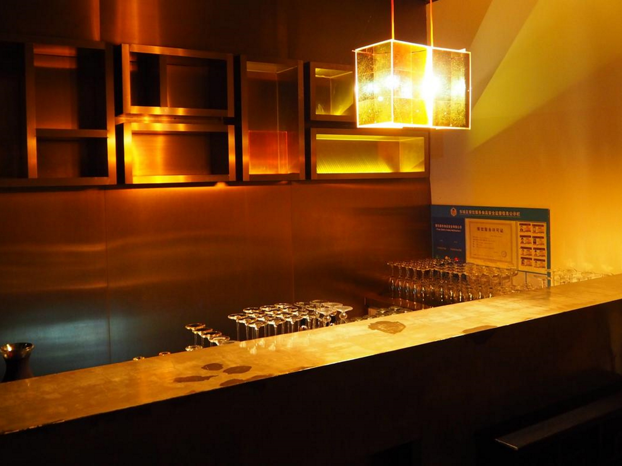
The positive properties of colours can easily be employed to frame restaurants, cafes and canteens. First and foremost, the wall colour acts as a support for the room concept: white walls can have a great, fresh effect, while a subtle grey tone exudes class and a warm beige looks cosy. Dark rooms are made to shine with a deep yellow. Different nuances of one colour have a completely different effect and even influence the perception of other colours, such as that of furniture. This effect can also be created with coloured accessories and decorations: but be careful if there is too much colour or poor mixing ratios, as these can also arouse negative emotions. Tone-on-tone combinations or colour triads are always a good choice.
As an alternative to classic wall colours, concrete, plaster, fabric coverings, wallpaper, stone, wood and tiles are popular design elements in the catering industry. In addition, moss, cork, leather and large-format pictures offer an opportunity to create a certain flair through the wall design.
One of the most important tools when decorating a room is light. Light sources serve as a functional orientation and are an effective design tool. Light draws attention and makes a significant contribution to creating a certain atmosphere. It also affects colour perception. Most colours appear dimmer and darker when the sky is cloudy. Light can make colours appear warmer, colder, softer, brighter or duller. Textures also influence the light reflections and can make colours glow or dampen the colour effect.
People feel most comfortable when the lighting concept also takes into account seasonal changes: In spring we look for soft, mild light, while in summer we find shady places more pleasant. Soft brightness has a particularly positive effect in autumn and pleasantly warm light is ideal on short winter days. Based on this, the biological rhythm also plays a role. Lighting concepts can make use of this effect and positively influence people's moods through the design of the guest rooms. We feel particularly comfortable in a bright breakfast room, where a lot of daylight flows in through large windows. In the evening we prefer to go to dark pubs, bars and restaurants.
As with the colour design, the gastronomic lighting concept is also suitable for responding to the spatial proportions. Light can make rooms appear narrower, wider and larger, for example, well-lit tables with dark spaces in between offer a pleasant contrast and create a feeling of intimacy.
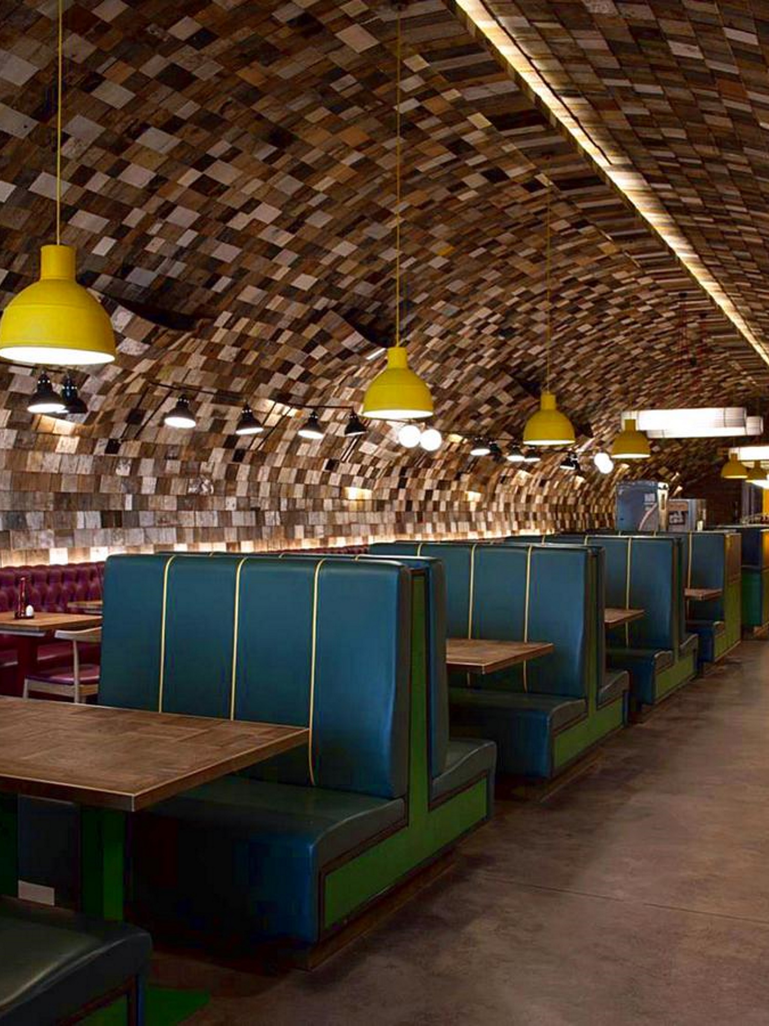
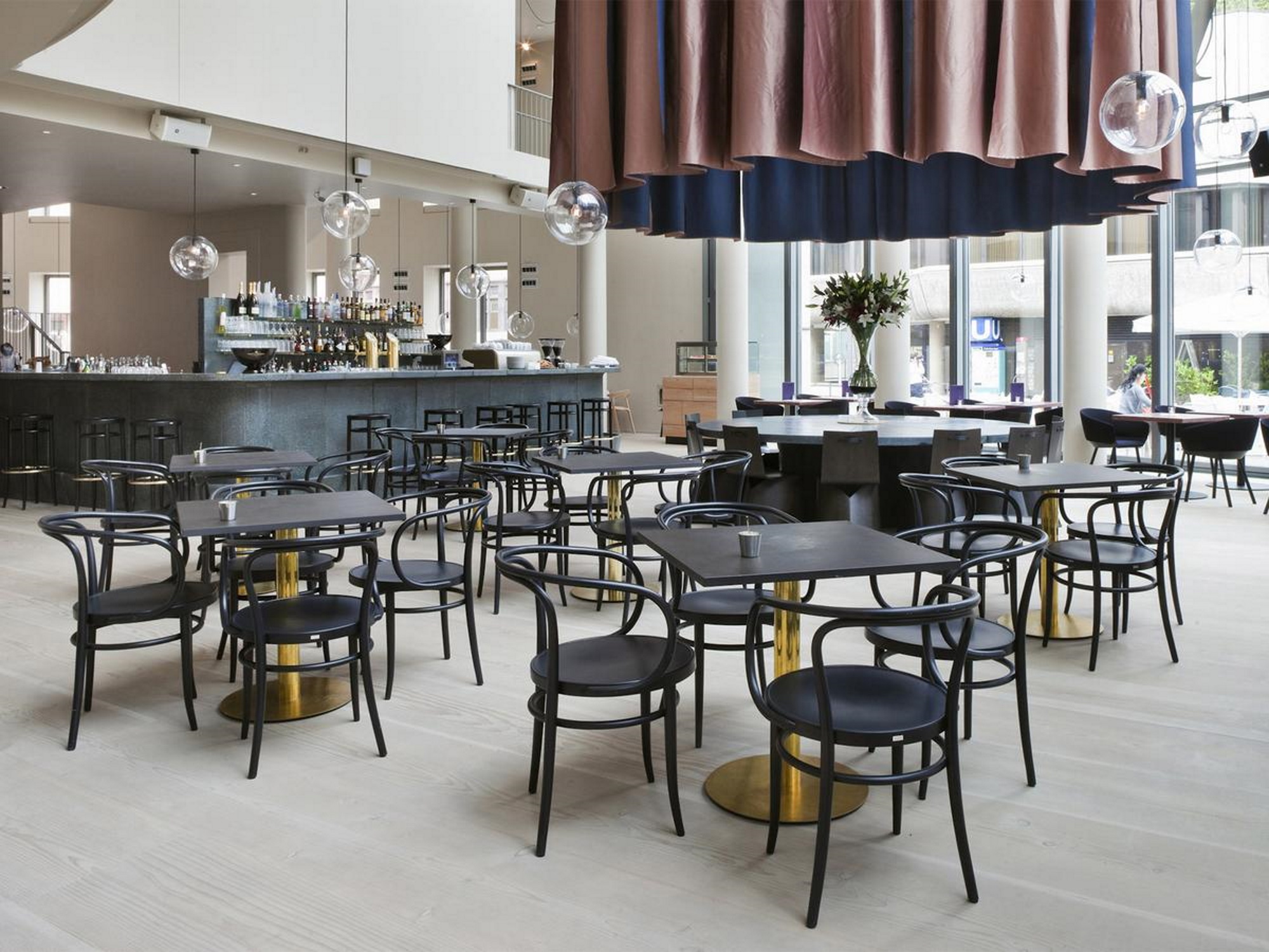
The core of a hospitality space is the furniture. Once the decision has been made in favour of a style, the focus of professional interior planning is on harmonious design using various types of arrangement. With a symmetrical structure, the individual pieces of furniture create a calm frame. Mostly, however, an asymmetrical arrangement is chosen, which is varied and lively. As a design standard, professionals often fall back on the golden ratio. In modern furnishing planning, the principle of rowing is also used: By placing similar elements in a row, an impression of generosity and tranquillity is achieved. In this sense, for example, evenly surrounding benches in front of the windows visually expand the space.
Functional catering furniture requires high-quality models, as they can be used for many years without causing problems to the operation. In addition, the functionality is primarily based on the catering concept: whether comfort, elegance or avant-garde, the most important thing is always that seating furniture and tables are coordinated. Typical furniture for all gastronomic concepts include:
