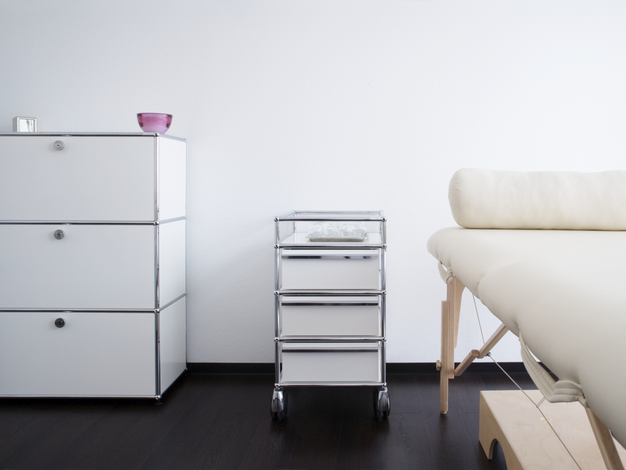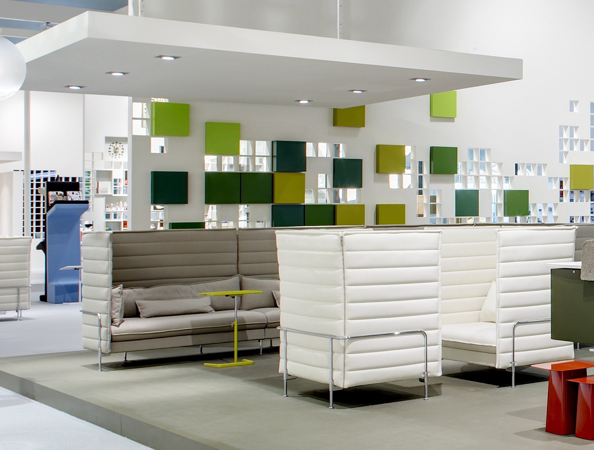

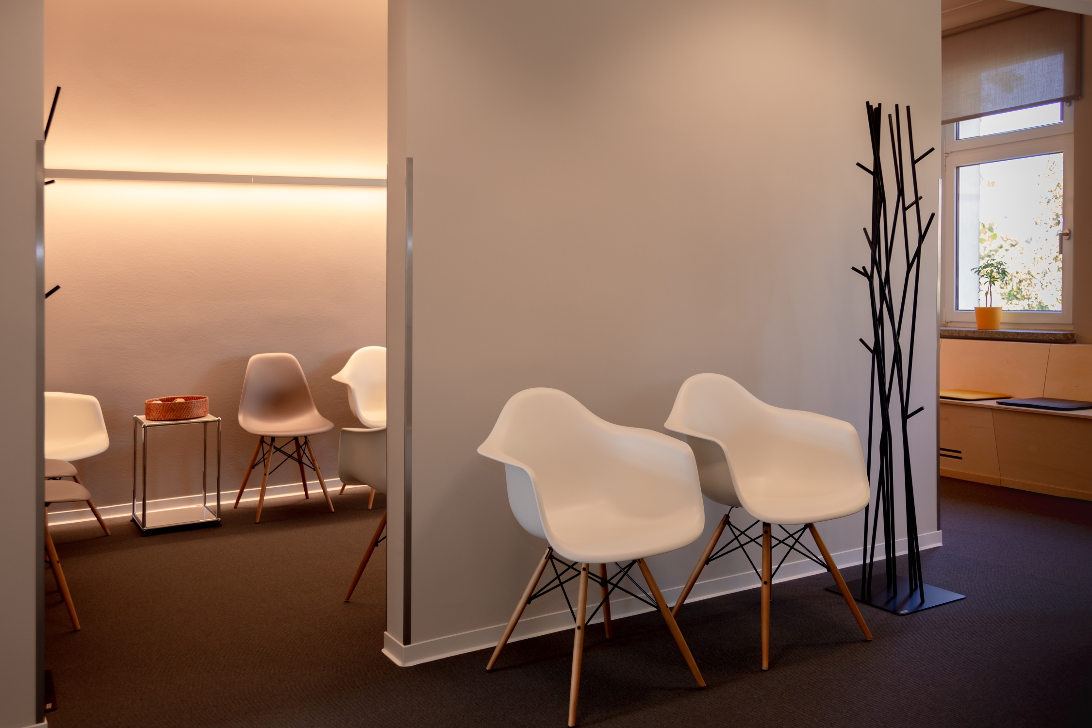
A visit to the doctor doesn't just begin in the treatment room, but rather at the reception and in the waiting room and tends to proceed more smoothly if you have the feeling there that you are in the best hands. A consistent, well thought-through, design concept ensures a positive and confident overall impression with a lasting effect, in addition to offering technical support. And while the best fit interior recipe differs from doctor to doctor, there are some functional, legal and aesthetic tips for the design of the reception area and waiting room that should always be considered when planning.
Whether a new building, a conversion or a renovation of a practice, the big picture always comes first. In addition to medical competence, it should also reflect personality and interpersonal relationships. The following aspects need to be combined:
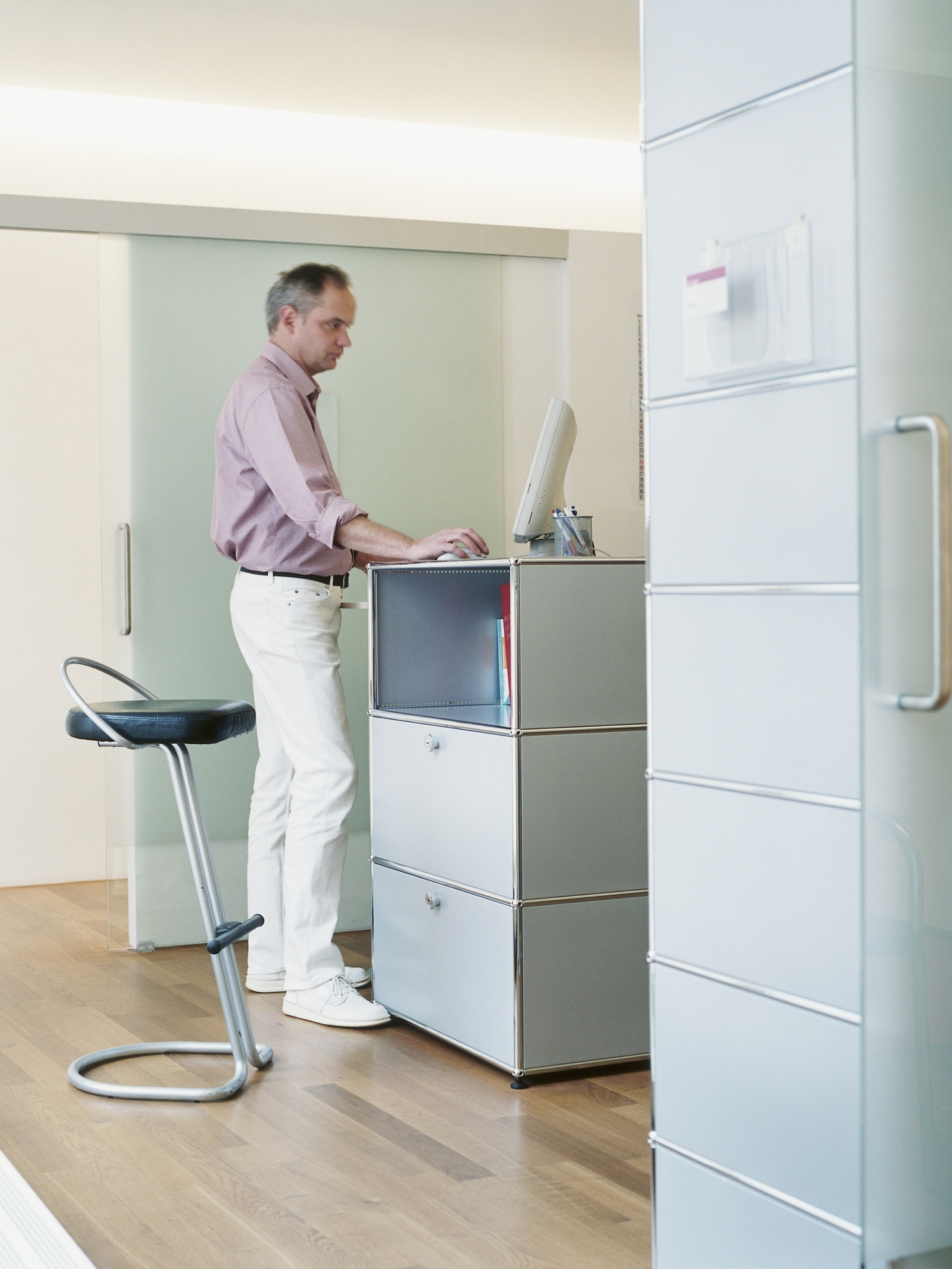
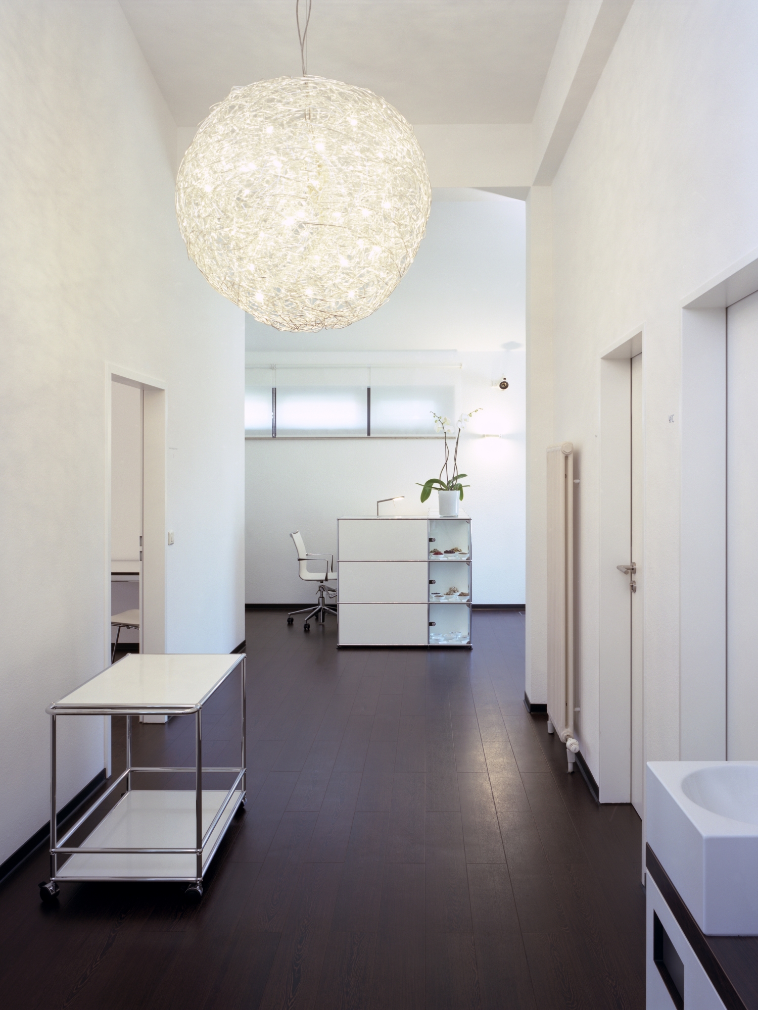
It all starts with the reception, a space which provides the patient's first impression and thus should give him a good feeling. The reception is where registration takes place, information is exchanged, appointments are made and documents are prepared for the doctors. In addition, it is the central work area of the practice team. The reception should thus not only be spacious and bright and have a good indoor climate, it should above all be designed in such a way that the staff are happy here, experience optimal working conditions and have everything ready to hand.
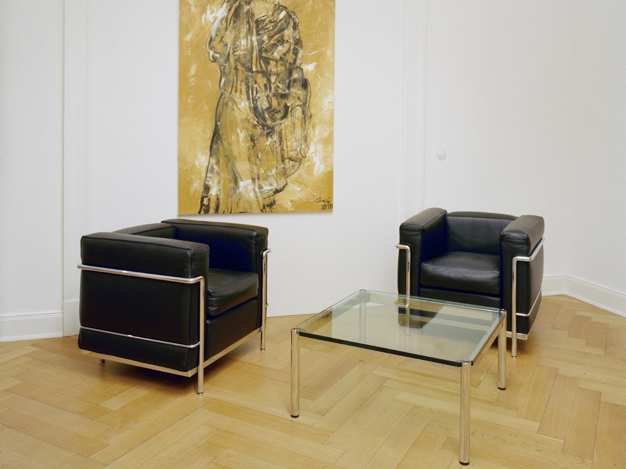
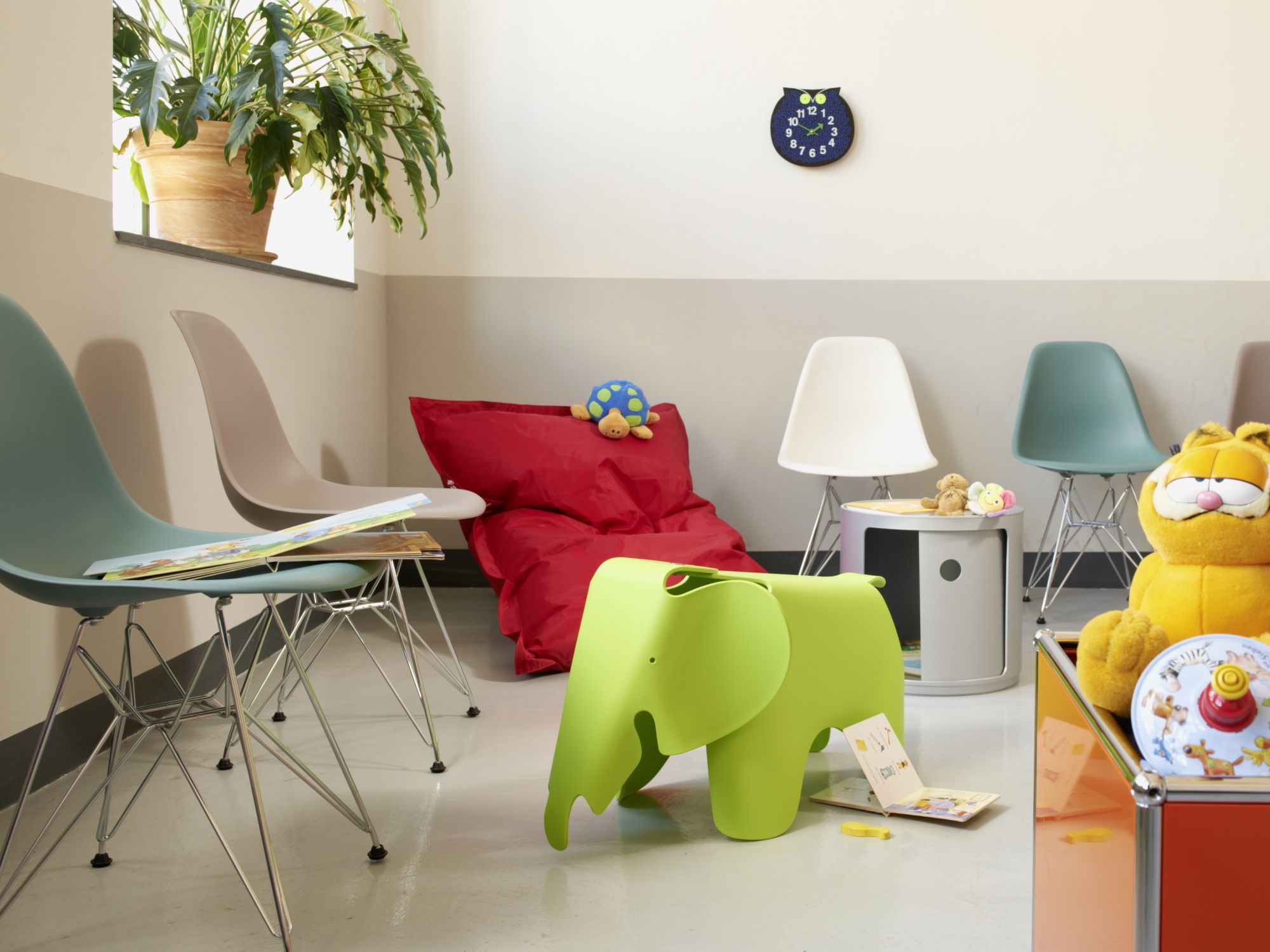
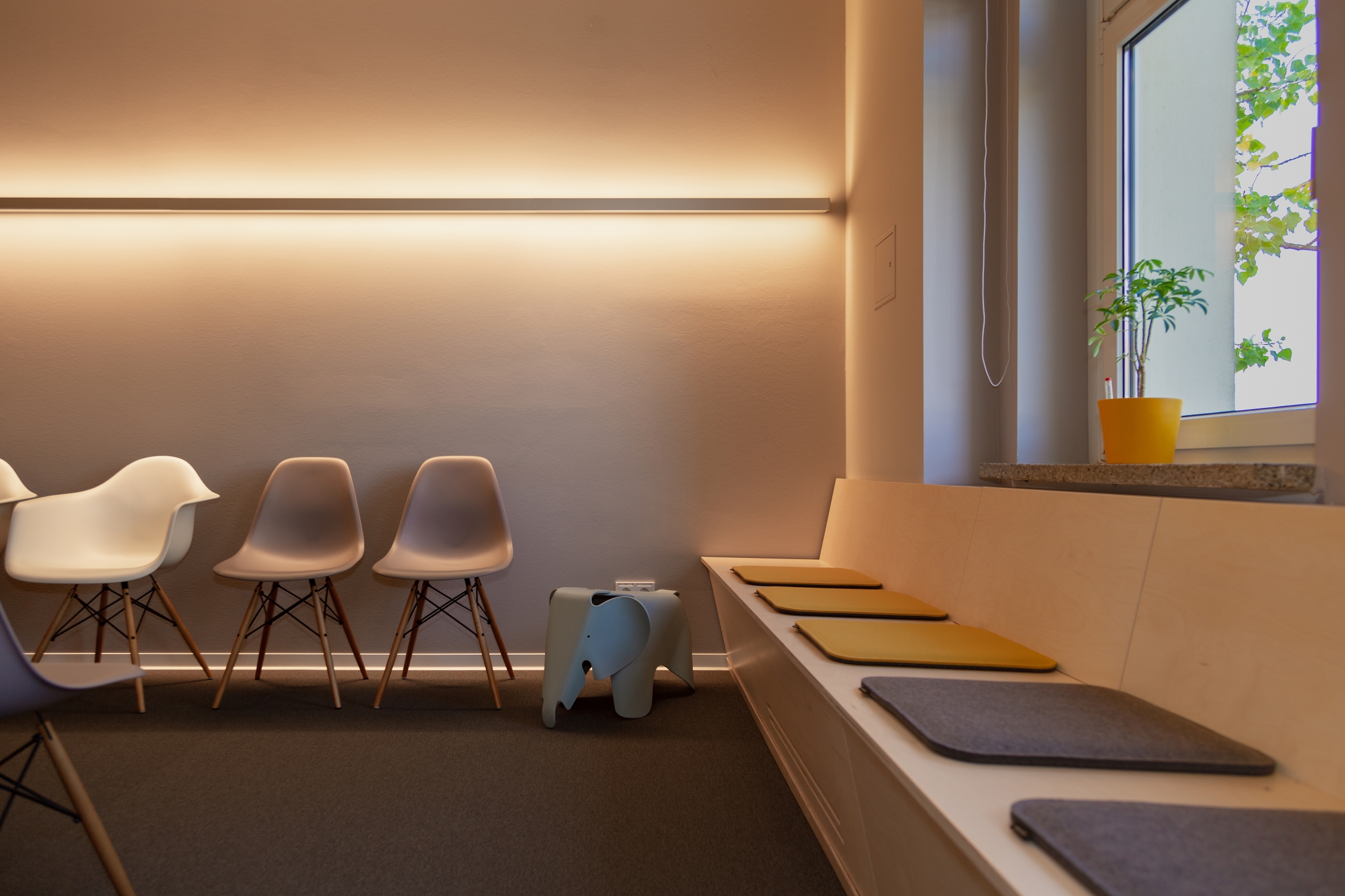
Hardly a visit to the doctor's isn't accompanied without waiting, which can usually not be avoided despite the best planning. With an integrated and coherent room concept this wait can however be shortened, or at least made to feel less long. In which context, lots of air and light, comfortable furniture, light and warm colours, interesting reading material and green houseplants make a significant contribution.
Not only functionality and design must go hand in hand, regulations also have to be adhered to. In order to avoid nasty surprises later, these should be taken into account when planning, not least because the rules not only affect occupational safety and protection against infection, but also the floor plan, for example, DIN standards for barrier-free construction, traffic routes, escape routes and emergency exits, room lighting, the placement of X-ray systems as well as sanitary and staff rooms. In addition to fire protection requirements, sound and heat protection and the necessary ventilation of the interior, there are also special functional requirements for floors, walls, windows and doors. The relevant regulations depend on the respective federal state:
In order to ensure infection prevention beyond the waiting room, many statutory health insurance associations have drawn up guidelines that regulate the entire hygiene management in medical practices. For areas without a greater risk of infection, such as the reception area or the waiting room, a principle focus is that floors, furniture and other equipment are easy to clean and disinfect. In addition, the materials used must be robust in order to withstand this regular treatment in the long term. Curtains, roller blinds and slats must also be wipeable or washable. Despite all hygiene measures, however, the right balance between sterility and comfort should always be sought so that patients can not only feel well protected but also feel good.
Light sets our rooms in scene and has a significant effect on our quality of life – it is not for nothing that light is often considered the fourth dimension in architecture. In a medical practice the lighting should be bright, welcoming and above all work-friendly. As far as possible daylight ensures a healthy and natural atmosphere; however, the optimal light depends on the respective room and must be coordinated with the colour concept. Even if white tones have a hygienic justification for medical clothing, a practice does not necessarily have to whitewash itself. Not only does such come across as monotonous, but also leaves a cold, impersonal and sterile impression: in contrast warm tones, pastel colours or even contrasts provide variety and fill the rooms with liveliness. And therefore a professional colour concept should be created that relaxes the patients, motivates the employees and, above all, fits the corporate identity.
A well-planned and well thought-out practice design not only fulfils functional requirements and aesthetic demands, it also functions as a unique selling point with which a practice can position itself and stand out from the competition. Therefore, the design concept should be based on the corporate design and follow the logo, the website and the print materials. This is the only way to create a rounded overall picture with recognition effect, which reflects competence, sovereignty and individuality in all areas – so that the doctor's visit can be a positive experience from the start.
